This post was written by guest author Ralph de Groot
There will inevitably be challenges along the way when making a website, particularly if you are just starting out. Problems that may arise for you include complicated navigation, unappealing design, unclear call-to-action buttons, and similar issues. But have no fear; the advice in this article will show you how to steer clear of such pitfalls in website development! Every action Kartra takes revolves around our clients. Assisting you in expanding your marketing and boosting sales is our top priority. Let’s get started.
#1 Complicated Navigation: Overlooking User-Friendly Layout
Creating a Confusing Navigation Structure That Hinders User Experience
Navigation has forever remained a crucial element, be it for ascertaining the location of a vessel, aircraft, or any other mode of transportation, as well as for the development of websites.
As per Real Inbound, a whopping 94% of individuals prioritize seamless website navigation above all else. The greater the duration of a visitor’s stay on your website, the higher the probability of them transforming into a customer who makes a purchase. Crucial, isn’t it?
Give careful thought to your website’s navigation. Think about who you’re designing your site for and in what way they’d be most receptive to the navigation structure you choose. To keep things from going horribly wrong, keep these common navigation options in mind when you build your site.
Horizontal Navigation Bar
On every page of a website, you’ll find a horizontal navigation bar positioned at the very top.
Certain individuals have a tendency to read in a left-to-right manner, which logically suggests that horizontal navigation would feel less foreign to them. Here’s an example of what it appears to be.

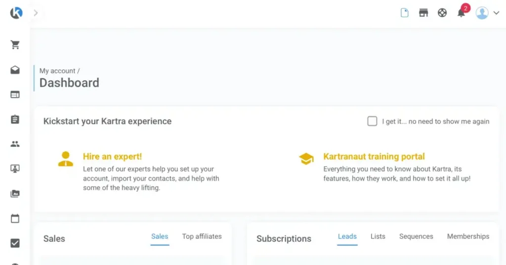
Vertical Navigation Bar
A vertical navigation bar is an excellent choice as it offers a seamless user interface. The choices are stacked on each other and organized in the sidebar. Although vertical navigation isn’t as universally embraced as horizontal navigation, it does present certain benefits.
Some businesses want to stand out by being unconventional. Given how uncommon this kind of navigation is, vertical navigation might be the better choice here. Here’s an example of what it appears to be.
Dropdown Navigation Bar
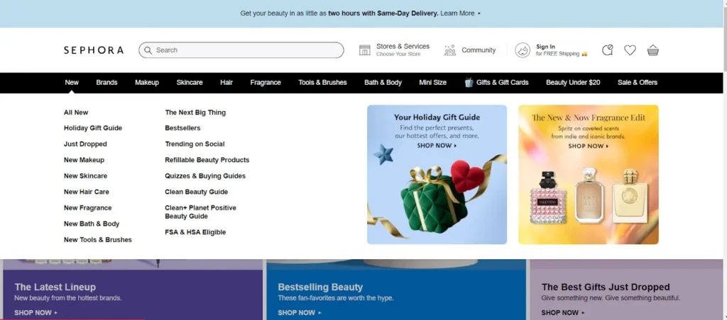
Utilizing dropdown menus is an excellent approach to maintaining the organization of your texts. When a user taps or hovers over a hyperlink, a dropdown menu will appear, providing them with additional links to explore.
E-commerce stores greatly value this choice as it provides them with a wide array of selections to present. Here’s an example of what it appears to be.

Here are more examples…

Quite convenient, isn’t it?
#2 Ignoring Mobile Responsiveness: Alienating Smartphone Users
Failing to Optimize for Mobile Devices, Reducing Accessibility for Smartphone Users
When making a website, make sure it’s mobile-friendly. The use of mobile devices has grown everywhere, impacting the lives of millions. All throughout the globe, people rely on smartphones and tablets for a wide range of communication, information, and entertainment needs.
As a matter of fact, it was predicted that the number of smartphone users around the world would keep going up by a total of 496.7 million users, or 10.71 percent, from 2024 to 2028. After five years of growth, the number of smartphone users is expected to hit 5.1 billion in 2028, which will be a new high point. Have a look at this chart.
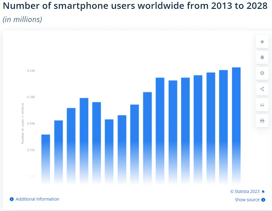
Having a website that is optimized for mobile devices can significantly boost your search engine optimization (SEO) endeavors. Additionally, it will showcase your dedication to fulfilling your customers’ needs and allocating resources to provide an outstanding online experience!
#3 Information Overload: Cluttering Pages with Excess Content
Overwhelming Visitors with Too Much Information on Each Page
When designing a website, simplicity is crucial. Having too many requests can and will be confusing. Look at this page as an example…
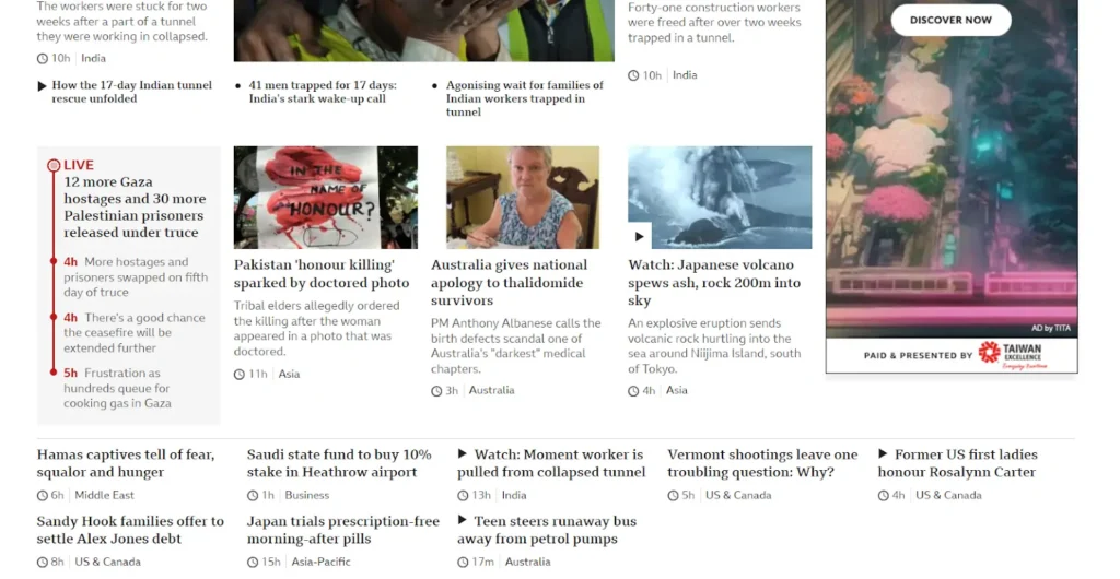
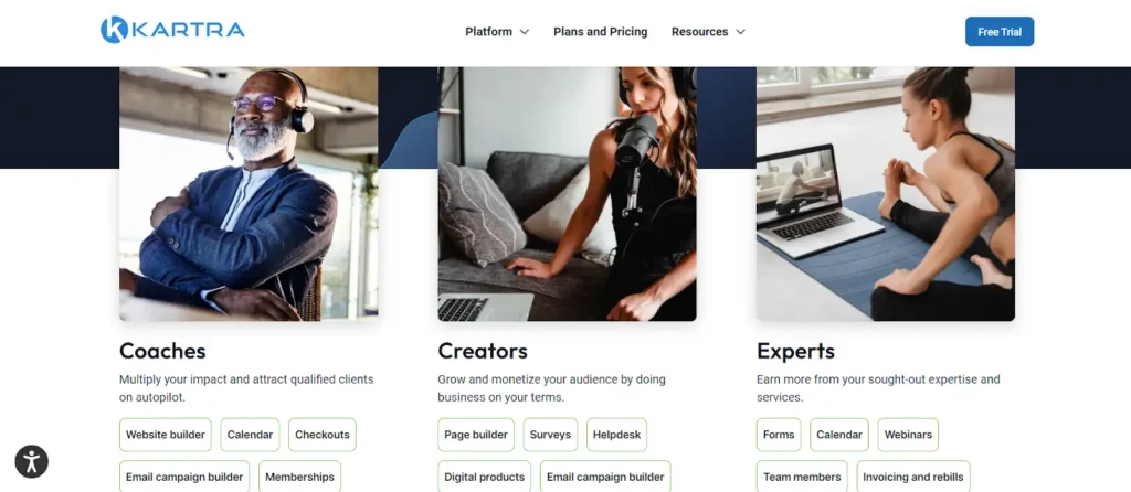
Does this feel like too much to read? Most people do. That’s why it’s so important to put the most important text first. Keep the visitor in mind and provide them with the information they need to connect with your brand. You can also include spaces to give a text the attention it merits. Here is an example of a page that’s easier to consume.
Here is another example of a page that’s easy to read…
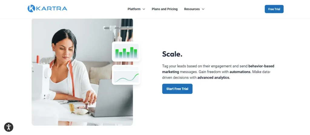
Did you notice how the empty areas aided in your concentration by eliminating any possible distractions? Simplifying things is the key to maintaining someone’s focus!
Spaces aren’t the only thing you should be thinking about while designing a website; typography, user experience (UX) basics, and jotting down enticing ideas are also good places to start.
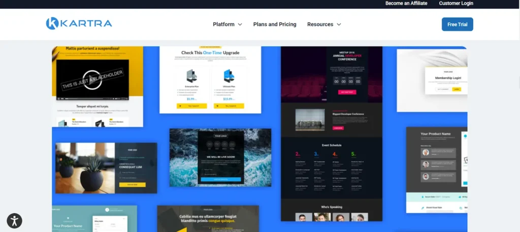
If you’ve decided on a design and would like to start creating a website already, Kartra can help you save time. Kartra boasts a team of skilled designers who have meticulously crafted an extensive collection of more than 500 page and section templates. Simply look through and select your favorites!
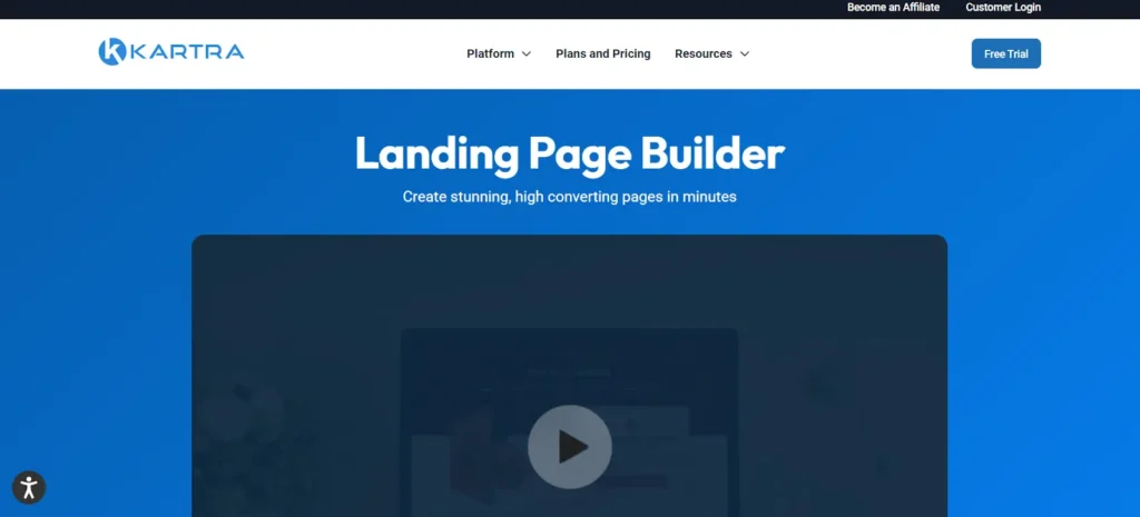
If you’re not feeling imaginative, or just need to assemble a page quickly, Kartra offers a selection of more than 100 stunning full-page templates. No matter what kind you require, no matter which field you cater to, you’ll discover a breathtaking pre-designed template that perfectly meets your needs. Overall, you can create, market, and scale! To view the prices it offers, go here.
#4 Long Load Times: Testing Users’ Patience with Slow Performance
Neglecting Website Speed, Leading to Frustratingly Long Load Times
Websites that load quickly are the best. Here are some pro tips to avoid long loading times on your website.
- Improve picture clarity
Website images usually take the longest to load because their files are so big. Thankfully, image optimization techniques can reduce image loading times. You can reduce the image’s resolution and dimensions as much as you like.
- Cut down on redirects
Your website’s loading speed will suffer if there are too many redirects. To eliminate any undesired redirection, uninstall the plugins responsible for them. Make sure to regularly scan your website for 301 redirects that direct to inactive pages. Stay vigilant.
- Use caching
Caches enable devices to access data efficiently, resulting in faster operation. The data is stored locally, rather than periodically downloaded, making it easier to access at a later time. Impressive!
- Put an end to plugins that aren’t needed
Plugins vary in quality. A site’s performance could suffer due to unneeded bloat caused by an excess of plugins. In order to determine which plugins are causing your website to slow down, you must remove each plugin individually, followed by retesting to assess any potential impact on your site’s performance.
#5 SEO Negligence: Missing Out on Search Engine Visibility
Overlooking SEO Best Practices, Diminishing Search Engine Ranking Potential
You can’t afford to ignore search engine optimization (SEO) if you want more people to see your website and, hopefully, make a purchase from you.
SEO is all about the numbers. Websites require technological optimization and substantial, useful content in order to rank effectively in search engines. As a beginner, you may want to think about these excellent practices.
- Performing research
Gathering relevant information is the initial stage in crafting an SEO plan. If you want to know more about your industry, products, or services, you need to be aware of the search terms that your target market will use.
An overwhelming amount of communication can take place in the blink of an eye on the internet, from sending and receiving messages to reading and sharing countless emails. Aside from that, a massive amount of content is ingested.
Did you know that in only one minute in 2022, internet users throughout the globe streamed an astounding one million hours of content? Here’s the data:
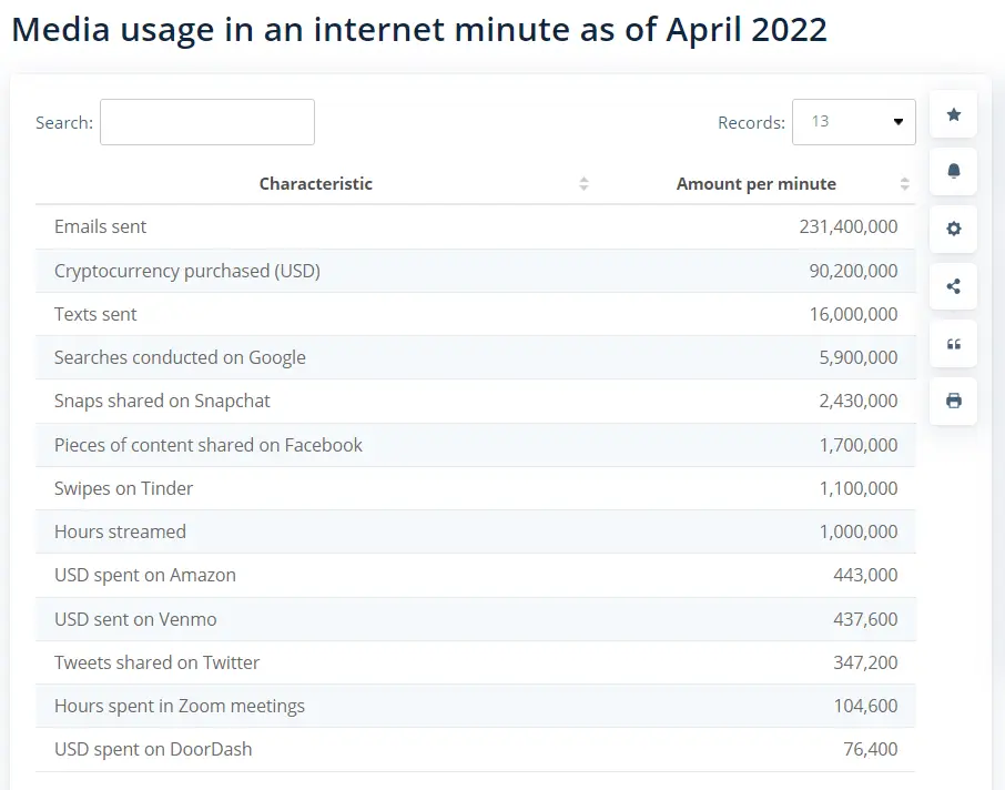
Look at all those 5,900,000 Google searches in under a minute! If you want to appear on the first page of search results, you need to be competitive.
- Publish high-quality, authoritative material
When it comes to search engine optimization (SEO), nothing beats publishing high-quality, authoritative material! Make sure that your posts are in tip-top shape to establish yourself as an expert in your field. Your content can be in the form of articles, product pages, blog posts, lists, guides, and similar to those.
#6 Bad Content Quality: Compromising Site Credibility
Publishing Poor Quality Content, Undermining the Website’s Credibility
Bad writing is a big issue in content marketing as it wastes people’s time and makes them leave your website quickly. As a result, they won’t use your product or service. Here are a few methods to prevent jeopardizing site credibility.
If you want to swear off making low-quality content forever, the first step is to get good at spotting it. Google does not appreciate low-quality posts that exhibit the following characteristics:
- Errors in grammar and language usage
Poor language, misspelled words, and difficult-to-read sentences make blogs difficult to read. Don’t waste excellent ideas by delivering them in a bad way.
- Unoriginal content
Given the abundance of similar subjects on the internet, it is challenging to deviate from resembling responses and concepts. To prevent creating content that lacks originality, it is necessary for you to surpass the ordinary and run lots of research.
- Lacking structure and conciseness
In the absence of proper structure, your piece will be difficult to read, and people will likely leave. Take note of the H2 and H3 headings to split up your post. Stay away from wordy paragraphs that bore readers.
- Outdated and old material
Avoid losing visitors by writing about the most popular topics. The past no longer piques anyone’s curiosity. Always plan ahead and adapt to new circumstances. It is common knowledge that search engines like Google always aim to provide the most up-to-date information on any given topic.
- Vague content
As a potential customer, I would likely depart if the material I am perusing lacks depth. I arrived seeking a response and anticipated encountering a professional delivery, correct? I am certain that you are as well!
#7 Weak Security Measures: Exposing the Site to Risks
Implementing Inadequate Security, Making the Site Vulnerable to Threats
Inadequate safety precautions are like carrying a ticking time bomb. If you don’t safeguard your computer when you’re online, your personal information could be accidentally lost or stolen. Hackers can access your computer through many online techniques.
I’ll provide you with some tips on how to have strong security measures.
- Refrain from using the same password for several accounts
Password reuse puts all of your accounts in danger in the event that a hacker obtains knowledge of your password. Passwords that are both simple and difficult to guess are ideal. Using both uppercase and lowercase letters, or making up your own acronym from a meaningful phrase, are two good strategies. You shouldn’t also change your password too frequently after you have one that works.
- Make it a habit to frequently install security updates
Avoid putting yourself in a position where you can be easily targeted. Certain bugs pose potential security threats, and these can be promptly resolved through an update. Security patches can also address weaknesses in the face of emerging attacks.
- Remain signed in
By frequently switching between logging in and out, you increase the risk of unintentionally accessing a fraudulent website that aims to gather your login credentials.
- Provide an alternate email address or phone number for recovery purposes.
This enables the service provider to recover your account in the event of a security breach.
- Discover the ins and outs of two-step verification
Enhance your security by incorporating an additional layer to your password, like a unique verification code delivered through SMS, which is required for a successful login to your Google Account.
- Learn about the security software you use
Your gadgets and personal information can be better protected with the right apps and settings, but these tools are useless without sufficient training. If you want these tools to provide you with the most protection possible, you need to learn how to use them properly.
- Make use of a Virtual Private Network (VPN)
A virtual private network is a must-have whenever you access the web from a public Wi-Fi hotspot.
- Back up your data
Back up your data regularly so you can protect yourself from viruses and inadvertent deletion. Particularly for enterprise-level data, cloud backup is the most foolproof method of data protection and integrity maintenance over time.
#8 Unappealing Visual Design: Deterring Users with Poor Aesthetics
Choosing Unattractive Color Schemes and Fonts, Detracting from User Experience
Websites that are aesthetically pleasing, user-friendly, and conversion-optimized are the result of investments in high-quality aesthetics. As a result, you can increase your conversion rates, gain more visitors’ confidence, and strengthen your brand’s reputation.
Website design is a perfect example of how important first impressions are. A first impression of your brand is formed in the blink of an eye the moment a visitor comes upon your page. Their decision to remain and investigate further can be swayed by this first impression.
Here are a few suggestions to enhance the visual appeal of your website.
- Opting for the right colors
Every web designer must adhere to a specific color scheme that aligns with the brand or company. To create a fantastic initial impact, opting for the right colors is key! The colors will create the atmosphere and will impress your guests immediately. You have the choice to select from monochromatic, analogous, triadic, tetradic, and many other options!
- Adding images
Photographs, diagrams, or illustrations can be included! Always check that the images you use are appropriate and will add value to your message.
- Typeface options
For the sake of website aesthetics, legible language is essential. Avoid making text look tacky by using bad color or sizing, and avoid using complicated typefaces or effects.
- Having a well-made layout
A poor layout will cause users to subconsciously ignore it, leading to higher bounce rates. A visually beautiful website is one that is organized and free of clutter. If you need help with this one, you can return to #1.
- Utilizing empty spaces
Whitespace offers you additional room to inhale. Your guests will have the opportunity to focus on the most important elements.
- Maintain a harmonious blend of text
Your viewers may feel overwhelmed and find it difficult to focus when there is an excessive amount of content! Strive for balance at all times.
- Keep ads to a minimum
People will quickly abandon your website if they notice even a hint of spam or pop-ups—which are unfortunately commonplace online. Some visitors could become so annoyed by ads that they decide to never return to a website.
#9 Complicated User Interface: Hindering Easy Interaction
Designing a Complex User Interface, Making Site Interaction Difficult
What makes a website easy to use is its user interface. The term “user interface” encompasses a lot more than just the visual aspects. It is the sum of all the qualities and functionalities offered by your website or program.
The ability to provide a uniform and pleasant user experience across all devices is a major strength of responsive design. People can see what they’re looking for without pinching or scrolling, and menus are usually easier to use. Everyone’s happy!
#10 Lack of Clear Call-to-Action: Missing Engagement Opportunities
Failing to Include Clear Call-to-Action Elements, Losing Potential User Engagement
In order to encourage your audience to actually become a client or customer, you should use your call to action (CTA). These buttons prevent wearing out decision-makers, simplify the user experience, and instruct your clients where to go and what to do next.
Please have a look at this particular one.

You’re eager to click the buttons so you can see what’s up, right? That’s the power of CTA buttons!
Conclusion
When designing a brand-new website in the year 2025, there are more than just ten possible mistakes to avoid. Hundreds of troubles could arise, I’m sure of it. Regardless, I wish you the best of luck with this guide!
About the author
My name is Ralph de Groot. I love excellent web design. In fact, you can wake me up at night if you find an inspiring website. Besides writing on My Codeless Website I also love to read and travel.

About Kartra
This blog is brought to you by Kartra, the all-in-one online business platform that gives you every essential marketing and sales tool you need to grow your business profitably – from sales pages and product carts to membership sites, help desks, affiliate management and more. To learn how you can quickly and easily leverage Kartra to boost your bottom-line, please visit kartra.com.

