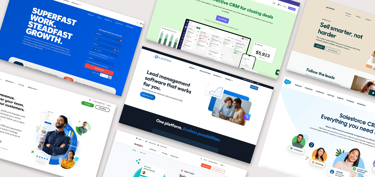
These guidelines present the “how-to’s” for using the Kartra brand to create effective communication that will help maintain a distinct brand presence and uniformity.
To provide the ultimate platform to grow your audience, monetize your content, and scale with confidence.
01
Our Logo
Our logo and “K” are how we’re recognized by millions of consumers and businesses around the world. We have 1 version of our logo with the icon and logotype stacked horizontally.
02
Logo Variants
Typically, these variants maintain the core elements of the logo while adjusting details for optimal visibility and legibility in different contexts.
The logo requires a boarder of that is free of imagery and text surrounding it. Use half the Icon’s height to determine the minimum amount of safe space that should surround the logo.
04
Logo Use
Our logo and “K” are how we’re recognized by millions of consumers and businesses around the world. We have 1 version of our logo with the icon and logotype stacked horizontally.
05
Interaction
We are transitioning to a new pill shape CTA and have defined new use cases for each version. Refer to the UI kit for hover states. We are using flat colors without gradients, the gradients will be used only for promotions and special use cases.
Use for: secondary CTA when paired with primary CTA
INTERACTIVE TOGGLE
Monthly
Yearly
Use for: pricing swap
Automation
Use for: interactive tabs
06
Our Colors
Kartra’s professional, positive tone is captured in our clean, cool toned color palette.
Primary colors: use for section backgrounds to provide contrast between content sections.
Secondary colors: blue & green used for CTAs; purple used for promo ads and call outs; off-black used for display and body text.
Primary
bright blue #227BCE
bright blue #227BCE
deep navy #041A2A
Secondary
green #08CF65
purple #6938EF
light grey 100 #E3E8EF
light grey 50 #F8FAFC
text black #202939
07
Gradients
Gradients are used as backgrounds for photography, UI screens and frames to add support to the design and content. Gradients can be used in shapes, frames and background elements.
#065EAF
#067FEF
#AD00FE
#00E0EE
#E2B0FF
#9F44D3
#39A0FF
#8FFF85
#372569
#602CD1
08
Product UI
Examples of product UI designs to help tell the story of the product feature. The library of the UI screens used in Kartra landing pages can be downloaded from the link below.
Clarity in communication is key for us, so we use the modern sans-serif font Outfit for all display text on brand and marketing materials, and Roboto for body copy.
Outfit bold is used for headlines and Roboto is used for text. This pairing creates contrast and calls attention to the content section in the design.
Case usage: we use sentence case for headlines, title case is used in CTA buttons and for product titles on the pricing page.
Desktop
Outfit hero heading
60px / 64px line height / Medium
Outfit section heading
48px / 52px line height /Medium
Outfit paragraph titles
18px / 22px line height / Medium
Roboto / paragraph / body
16px / regular
Mobile
Outfit hero heading
48px / 52px line height / Medium
Outfit section heading
36px / 40px line height / Medium
Outfit paragraph titles
18px / 22px line height / Medium
Roboto / Text Medium
16px / 24px line height / Medium
Roboto / Text Small
14px / 20px line height / Regular
11
Photography Key Attributes
Authentic
Engaging
Simple
Optimistic
Inspiring
Naturally lit
Diversity in casting
Candid
Relatable
Entrepreneurial
12
Incorrect Photo Use
Overly staged
Abstract
Metaphorical
Ultra wide/distant
Micro
Overly stylized color
Dramatic angles
13
Iconography
Our icon library is built into the Kartra Figma design kit. We use open, single-line icons that are minimal, modern and 1-color. These icon examples are from the Kartra UI kit.