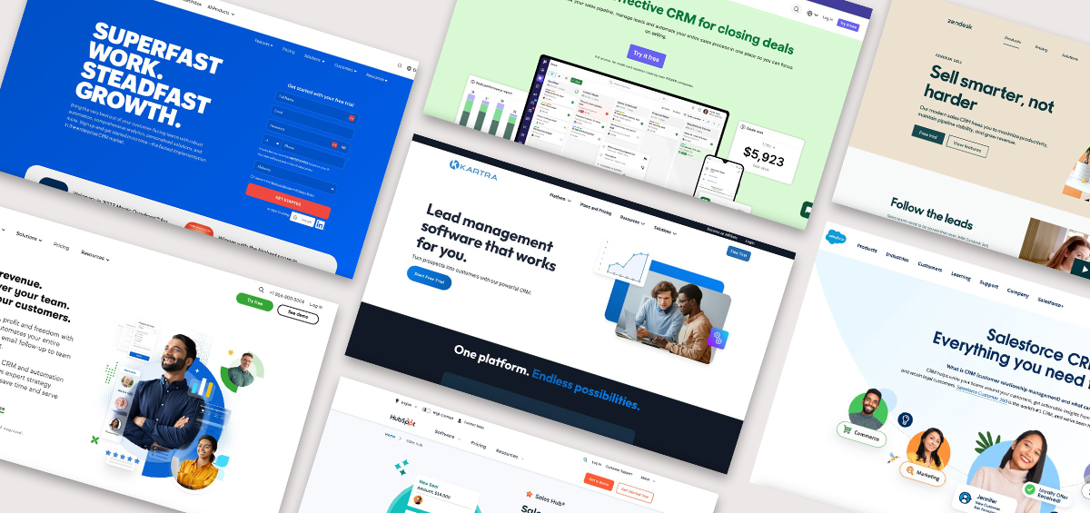
Your coaching business needs a website that sets the tone for your program, persuades potential clients to sign up for your services, and provides a helpful user experience for visitors and clients. That’s a tall order! But it’s worth it to have a website that successfully grows your business. Plus, with website builders and website templates at your fingertips, you don’t have to be a developer to create a great coaching website.
What Makes a Coaching Website Effective?
A high‑performing coaching website communicates who you help, what transformation you deliver, and the next step you want visitors to take — often booking a call, signing up for a lead magnet, or enrolling in a program. Effective sites use clear value statements, intuitive navigation, compelling testimonials, and strong calls‑to‑action that guide visitors toward becoming clients.
Kartra is an all-in-one platform built for entrepreneurs like coaches, and we’re passionate about helping your business thrive online! As you create or revamp your own website, explore this list of website examples for tips and ideas.
Coaching Website Examples for Your Inspiration
We’ve curated a list of some of the best coaching websites across many different coaching niches — career coaching, leadership coaching, life coaching, parent coaching, health coaching, and more. There’s much to learn from how other online coaches present their businesses, whether they align with your industry or run a totally different kind of program!
Example #1: Dana Stevens
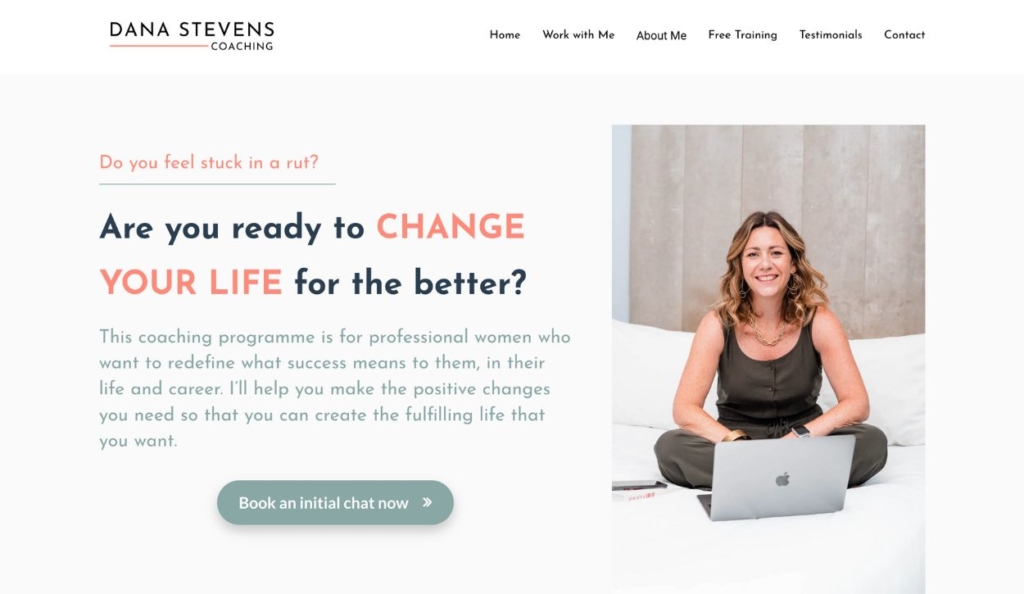
Dana Stevens provides career and life coaching to help women shift their mindsets and enact positive change in their personal and professional lives. Her program focuses on building confidence, combating stress and burnout, and helping clients create a clear action plan for success.
What Stands Out:
- Messaging resonates with clients’ pain points
- Clear value proposition and target audience
- Friendly, relatable brand tone
Example #2: Mary Blalock

Mary Blalock specializes in career coaching, offering support in job transitions, resume building, interview preparation, and confidence building for career success. On this engaging career coaching website, bright colors, headings, and buttons provide clarity and draw the user’s eye to the most important actions: “free consultation” and “log in.”
What Stands Out:
- Straightforward value proposition and service offerings
- Bright, inspiring brand tone
- Clear call to action (CTA)
Example #3: Luisa Zhou
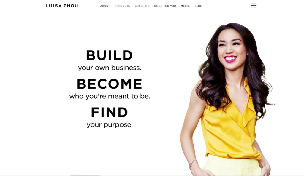
Luisa Zhou is a celebrity in the coaching industry, and there’s a lot to learn from her success story. Her site is text-heavy, which is well-suited to her exclusive, high-end business coaching and mentorship program. This website is great example of how online coaches offer a wide range of products, services, and resources as their business grows.
What Stands Out:
- Honest, inspiring brand tone
- Clear copy that educates and sets expectations
- Creative variety of products and services
Example #4: Jonathan Goodman
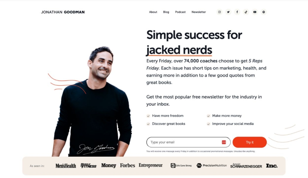
The Personal Trainer Development Center (PTDC) created by Jonathan Goodman offers resources and mentorship for health and fitness professionals. This website features a clean and modern design with an intuitive layout that makes navigation easy. And strategic placement of calls-to-action encourages engagement and interaction with the site’s resources and services.
What Stands Out:
- Clever copy that resonates with audience
- Immediate social proof
- Compelling personal brand
Example #5: Shereen Hoban
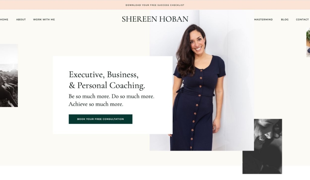
Shereen Hoban provides executive coaching, business coaching, and personal coaching to help clients fulfill their personal and professional goals. Her website is clear but creative — incorporating social proof, visualizing her years of experience, and breaking down the various programs she offers.
What Stands Out:
- Creative website design elements
- Compelling copy
- Sophisticated brand tone
- Use of header for freebie
Example #6: Joyful Parents
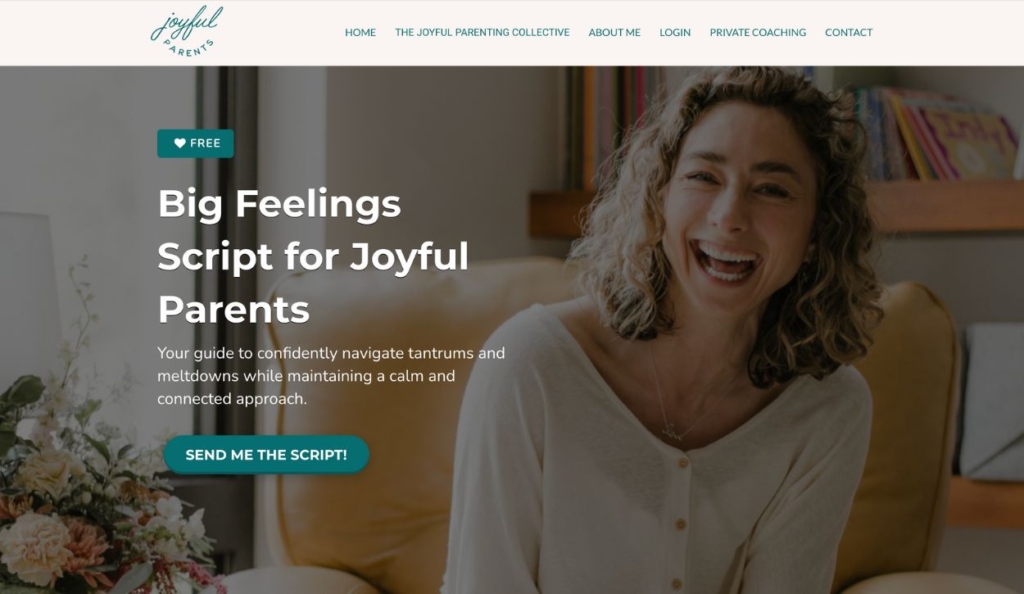
Myla Leinweber’s coaching program Joyful Parents helps parents foster joyful and harmonious relationships with their young children. Clients can choose between a group coaching program or private coaching sessions, and the site offers many free resources that build trust in Myla’s coaching methods. You’ll also notice a membership functionality, where clients can log in to a member portal on the website.
What Stands Out:
- Consistent, joyful brand tone
- Compelling lead magnets throughout the site
- Variety of services and products
Example #7: Better Day Coaching

Christina Golden’s life, health, and relationship coaching services at Better Day Coaching help women experience healing and growth. This website is a good example of how strategic copywriting will speak to the audience’s experiences, pain points, and values.
What Stands Out:
- Intentional messaging that resonates with clients
- Calm and professional brand tone
- Simple, straightforward layout
Example #8: Needles & Spoons
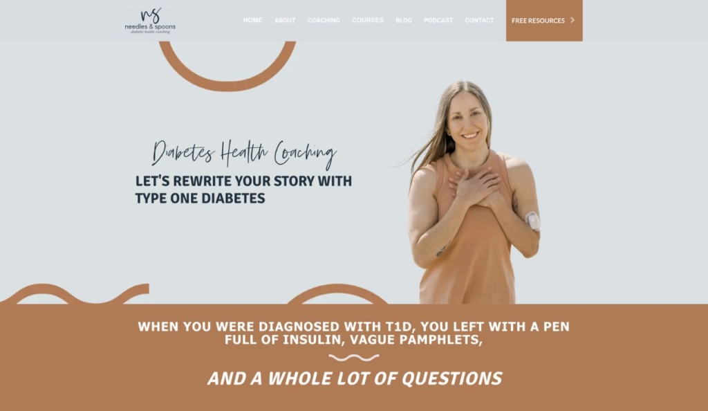
Lissie at Needles and Spoons specializes in diabetes coaching, offering personalized support and strategies for managing diabetes effectively — focusing on lifestyle changes, nutrition, and mindset. This coaching site is designed to immediately resonate with the target audience, empathizing with their challenges and showing a path forward.
What Stands Out:
- Positive, understanding brand tone
- Addresses clients’ pain points
- Wide range of helpful resources
Example #9: Kristin Webster
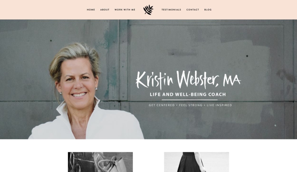
Kristin Webster is a life and well-being coach who helps women navigate career transitions, develop leadership skills, and live their best lives personally and professionally. Kristin’s life coaching website conveys strength and confidence, and it builds trust by outlining — in detail — her credentials and the structure of each coaching program.
What Stands Out:
- Strong, inspiring brand tone
- Detailed program overviews
- Compelling social proof and credentials
Example #10: Patrice Washington
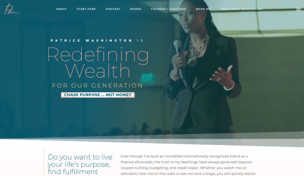
Patrice Washington offers financial coaching and personal development programs aimed at helping individuals achieve financial freedom, purpose, and well-being. One of the standout features of Patrice’s website is that it represents a compelling personal brand, not just a coaching program.
What Stands Out:
- Excited, knowledgeable tone
- Strong personal brand
- Interactive elements such as quizzes, videos, and podcast episodes
Example #11: Emily Osmond
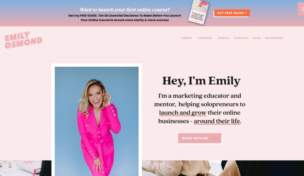
Emily Osmond offers business coaching for solopreneurs, focusing on marketing, branding, and business strategy to help clients grow their online presence and profitability. Bold colors and creative fonts convey Emily’s personality and set the tone for her coaching program.
What Stands Out:
- Clear value proposition
- Fun, friendly branding
- Social proof featured throughout the site
Example #12: Girls Gone Strong
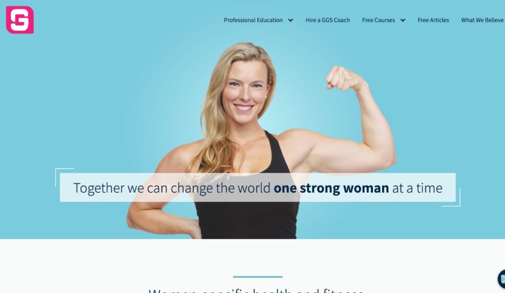
The Girls Gone Strong program offers fitness and nutrition coaching for women, promoting strength training, body positivity, and overall health and wellness through personalized programs and community support. This website strikes a great balance of providing thorough information while staying easy to navigate and keeping the reader’s attention.
What Stands Out:
- Consistent brand tone and design
- Copy that speaks to their audience
- Extensive educational materials
How Should You Use These Examples to Build Your Own Site?
Studying great coaching websites gives you insight into layout, messaging, conversion paths, and visual styles that work in real coaching businesses. When applying these examples:
- Identify common high‑impact elements like clear CTAs, strong hero messaging, and social proof.
- Think about your ideal client and tailor the structure and language to their needs.
- Match examples to your niche — for instance, life coaching sites may emphasize transformational storytelling, while business coaching sites focus on credibility and outcomes.
- Use the layout and content structure as inspiration, not imitation, to create a site that feels authentic and aligned with your brand.
What makes an effective coaching website?
You can see from these examples that success as an online coach looks different depending on the coaching model, industry, and client base. Get to know your clients, test ideas, and adapt your strategy to create a strong online presence for your business.
Here are a few characteristics you’ll find every successful coaching website needs:
A clear value proposition to reach your ideal client
As an expert in your field, it’s easy to get lost in the weeds as you create your website and write copy for each section. You know a lot, and have a lot to share! But in order to effectively reach your audience, your website needs to communicate the specific problem you solve and for whom.
This summary statement is called a value proposition, and it should be one of the first things homepage visitors see — both to increase conversions and provide a user-friendly experience.
Your value statement is likely to evolve as your business grows and you narrow in on what language resonates most with your clients, but it will always be a key part of the site experience.
Easy navigation for a great user experience
When online business owners create their website for the first time, they have to make some assumptions about what resources, tabs, and next steps should be readily available to the user. As time goes on, it’s important to pay attention to user behavior on your site and make sure you are funneling website visitors to the most relevant pages and resources.
Website tracking features like heat mapping help provide insights into which website pages are most important to your users. And remember that improving your website sometimes means paring down information – not just adding to it.
The navigation should be simple and intuitive, allowing prospects and clients to quickly access everything they need.
Messaging that builds trust
The coaching industry is all about trust. People want to know that their time, effort, and expense will pay off with concrete results!
As you grow your list of coaching clients, build a collection of testimonials, case studies, reviews, and success stories.
You can highlight clients’ experiences on a designated testimonial page or simply feature them throughout the site. What matters is helping future clients envision what they will gain from your program and how their lives will change.
Your personal expertise, experience, and credentials are also important to share throughout your website. But remember that the most compelling proof of your abilities will always be your track record of success. Be as specific as you can about who your coaching program has helped and how.
An authentic, holistic brand
A successful coaching website will paint an accurate and compelling picture of what it’s like to work with you. It should convey your values, personality, unique approach, and any other key differentiators of your coaching program. In other words, the website should reflect your brand.
Here are some brand-focused questions to ask as you build your website:
- What is the tone of my coaching business? What do I want to convey from the way that I speak and write?
- How do I want clients to feel when they visit my website and when they get on a coaching call?
- What is unique about the coaching services that I provide?
- What are my personality strengths?
- What type of client do I want to appeal to?
Curate the perfect tone for your website with real photos, carefully worded content – even videos.
And remember that consistency is key to establishing a persuasive and professional brand image. Your web design, written content, social media posts, coaching materials, and personal interactions with clients should all send the same message.
Frequently Asked Questions About Coaching Websites
What makes a coaching website successful?
A successful coaching website clearly communicates the transformation you offer, connects emotionally with your ideal clients, highlights credibility through testimonials or social proof, and guides visitors toward a clear next step like booking a call.
What should every coaching website include?
Every coaching website should include:
- A clear value proposition or headline
- Intuitive navigation and layout
- Compelling calls‑to‑action
- Client testimonials or social proof
- A story or “about” section that builds authority
These elements help visitors understand your expertise and encourage them to engage with your services.
How do I choose which example is right for my site?
Look at how each example uses messaging, layout, calls‑to‑action, and social proof to connect with its audience. Match those elements to your niche — for example, more personal storytelling for life coaches, strong credibility signals for executive coaches, and resource‑rich sections for career or business coaches.

