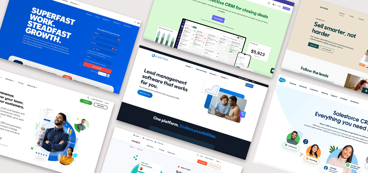
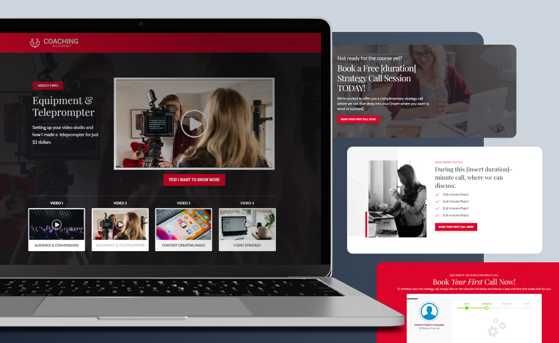
A well-crafted landing page is more than just a single web page; it’s a powerful marketing tool that can boost your sales and reduce acquisition costs. While marketing platforms like Kartra will help you do it quickly, diving in without a clear strategy can lead to missed opportunities.
To truly maximize the potential of your landing page, it’s essential to follow best practices that combine effective design elements with strategic messaging. These practices not only help create an attractive and functional page, but also ensure a seamless user experience that aligns with your brand. Let’s explore these proven strategies to help you design a landing page that looks great and drives real results.
1. What are Landing Pages and What’s Their Purpose?
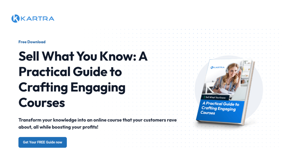
Landing pages are specialized web pages designed with a single, focused objective. Unlike regular web pages, which often serve multiple purposes and link to various sections of a site, landing pages are created to guide visitors toward a specific action.
Landing pages are a vital component of digital marketing strategies. They offer a focused, effective way to drive conversions, capture leads, and track campaign performance. Whether it’s capturing email leads, promoting a product, or encouraging webinar sign-ups, landing pages streamline the user experience to maximize conversions.
These pages typically feature a clear headline, compelling copy, and a prominent call-to-action (CTA) that directs visitors towards the desired outcome. By eliminating distractions and focusing on one goal, landing pages help businesses achieve their marketing objectives more effectively and efficiently.
By understanding and leveraging the power of landing pages, businesses can significantly boost their marketing efforts and achieve their goals.
Now that we understand what landing pages are and the purpose they serve, let’s discuss how to build them.
2. Best Practices for Creating Landing Pages
Creating an effective landing page begins with a clear understanding of its purpose. This foundational step shapes every aspect of your design and copywriting, ensuring your page effectively engages visitors and drives desired actions. Let’s explore how to define your landing page’s purpose, then move through the other necessary elements for success.
Identify Your Primary Goal
Every landing page should have a singular, well-defined goal. This goal dictates what action you want your visitors to take.
Here are some common objectives and how they influence your page:
- Capturing Email Leads: If your primary goal is to build your email list, your landing page should focus on offering something of value in exchange for email addresses. This could be a free eBook, a checklist, or a discount code. Your design should emphasize the lead capture form, and your copy should highlight the benefits of your offer.
- Driving Product Sales: For landing pages aimed at selling products, the design should be geared towards showcasing the product’s features, benefits, and unique selling points. High-quality images, persuasive copy, and a strong call-to-action (CTA) are essential. The layout should guide the visitor smoothly towards making a purchase.
- Promoting a Webinar: If your goal is to promote a webinar, your landing page should emphasize the value of attending the event. Highlight key topics, speakers, and benefits. The design should include a prominent registration form and engaging content that convinces visitors to sign up.
Once we’ve identified our goal, we can transition into crafting copy and messaging.
Crafting the Perfect Message: Speak Directly to Your Audience

The foundation of a successful landing page is a clear, compelling message. Your message should instantly convey who you are, what you offer, and why it matters to the visitor. This all starts with understanding your audience.
Understanding your audience is the cornerstone of creating an effective landing page. When you know who you’re speaking to, you can tailor your message and design, so they resonate with your audience’s specific needs, desires, and pain points. You should identify what their pain points are, and what solutions they are seeking. Tailoring your landing page to address these questions will set the foundation for a compelling and relevant experience. This targeted approach increases the likelihood of engagement and conversion because your landing page will feel personalized.
Now let’s get into the copy!
Crafting Compelling Messaging
Your landing page needs to make a great impression quickly. Your headline is the first thing visitors see and sets the tone for the rest of the page. Make it compelling and benefit-driven. You’ll want to use large, bold fonts and contrasting colors to ensure it stands out. Instead of focusing on features, emphasize how your offer can make a positive impact. Your headline should clearly state the benefit of your offer. Think of it as the hook that draws your visitors in.
Tip: Use action-oriented language that speaks directly to the visitor’s needs and desires. For example, instead of “Sign Up for Our Newsletter,” try “Unlock Exclusive Tips to Transform Your Fitness Routine Today!”
From there you’ll move into the body of your landing page. When creating this copy, you’ll want to focus on benefits–not features. By doing so, you’ll demonstrate that your offer solves problems, addresses the audience’s pain points and offers solutions for your reader. Use clear and concise language, avoid jargon, and incorporate social proof (like testimonials and reviews) to build trust. Bullet points can enhance readability and highlight key benefits effectively.
The last section in your copywriting is the call to action (CTA).
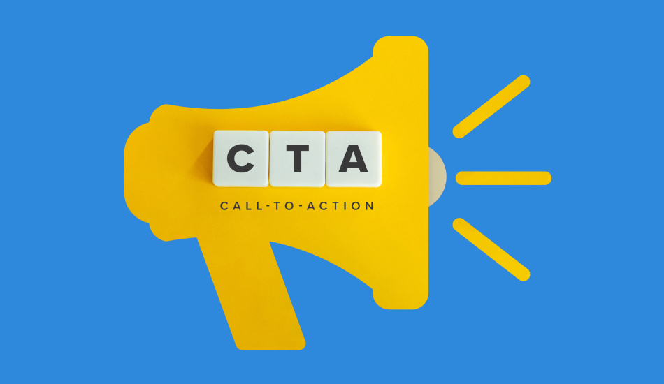
Your CTA is the action you want visitors to take, whether it’s signing up for a newsletter or making a purchase. Your CTA should stand out on the page in both design and placement. It should also be action-oriented with worlds like “Get Started” or “Claim Your Spot.” You’ll want to make sure you avoid overwhelming users with multiple options by sharing just one primary action.
CTA Tip:
- Create a Sense of Urgency: Use phrases that encourage immediate action, such as “Limited Time Offer” or “Sign Up Now.”
- Be Specific: Clearly state what visitors will get when they click the CTA. Instead of “Submit,” try “Get My Free eBook” or “Start Your Free Trial.”
- Stand Out: Use contrasting colors and strategic placement to make your CTA button pop.
3. Design that Speaks Volumes
Now that we’ve crafted our copy, let’s move into design.
Design isn’t just about looking good–it’s about guiding your visitors through your content smoothly. A clean, intuitive design ensures that your message is the star of the show. Here’s what to keep in mind:
- Simplicity is Key: A cluttered page can overwhelm visitors. Stick to a clean, simple design that directs attention to the key elements.
- Consistent Branding: Use colors, fonts, and images that align with your brand. Consistency builds trust and reinforces your brand identity.
- Attention-Grabbing Images: Use high-quality images that support your message. Visuals should be relevant and help tell the story of your product or service.
- Responsive Design: Ensure your landing page looks great on all devices: desktops, tablets, and smartphones. A responsive design improves usability and can boost conversion rates.
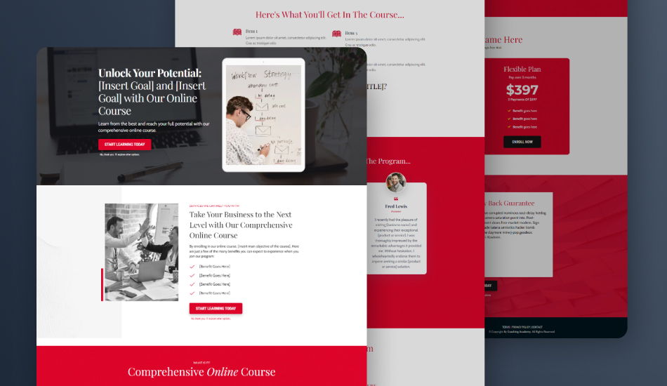
Tip: Kartra’s drag-and-drop builder makes designing your landing page easy, even if you have no online marketing experience. You can use its done-for-you, prebuilt landing page templates and customize them to your liking, building pages in record speed.
The work still isn’t completed after we’ve published our landing page, so let’s get into the final steps.
4. Test and Iterate for Optimal Landing Page Conversions
Creating landing pages that convert is an ongoing process that involves continuous testing and refinement. If possible, use A/B testing to compare different versions of your landing page. Experiment with various elements such as headlines, images, CTAs, and overall design to determine which versions resonate most with your audience. This approach helps you identify the most effective combinations for driving conversions.
Once your landing page is live, don’t stop there. Monitor its performance closely by using analytics tools to track key metrics like conversion rates, bounce rates, and time spent on the page. This data provides valuable insights into how users interact with your page and where improvements might be needed. Regularly review these metrics to spot trends and make data-driven adjustments to enhance your landing page’s effectiveness.
Remember, the key to a successful landing page is continuous optimization. Test one element at a time—such as a headline or a CTA—so you can accurately measure its impact on performance. Gather feedback from users and peers to gain fresh perspectives and incorporate their suggestions into your improvements. By maintaining a cycle of testing, analyzing, and refining, you’ll ensure your landing page remains effective and continually boosts your conversion rates.
Leverage Kartra’s Features
Landing pages may seem like a daunting task but you don’t have to go at it alone. As a Kartra member, you’ll have access to a suite of powerful tools to enhance your landing pages. Utilize Kartra’s drag-and-drop builder, advanced analytics, and customizable templates to create and optimize landing pages that drive results. Explore features like split testing and automated follow-ups to continuously improve your landing page performance.
Should you ever get caught up in writer’s block take advantage of Kartra AI, your own personalized writing assistant that’ll deliver on brand contextually aware content in seconds.
Kartra Tip: Take advantage of Kartra’s Done For You campaigns to jumpstart your landing page creation process with proven templates and strategies.
5. Conclusion: Your Landing Page Journey Begins Here
Creating high-converting landing pages is both an art and a science. With the right messaging, design, copy, and optimization, you’ll be well on your way to turning visitors into loyal customers. With Kartra’s powerful tools and features, you can implement these best practices with ease. So go ahead, put these tips into action, and watch your conversion rates soar!

