This post was written by guest author Steve West
Imagine your landing page as a magnet, irresistibly drawing in visitors and transforming them into customers.
That’s the power of a well-crafted landing page, and it’s within your reach.
In this guide, I’ll unlock the secrets to creating landing pages that not only catch the eye but also captivate the heart, turning casual browsers into committed buyers.
Get ready to dive into a world where every click counts, and every visitor is a new opportunity.
Let’s turn your landing page into a conversion powerhouse!

Understanding Your Audience
Before we get into the meat and potatoes of creating a high-converting landing page, the first thing you need to do is to understand your audience.
This step is critically important, yet a lot business owners either neglect it, or only gain a basic understanding of who they’re selling to.
Basically, creating a landing page that really clicks with your audience is like throwing a perfect party. You need to know who’s coming, what they like, and how to make them feel right at home.
In the world of marketing, this means diving deep into who your audience is. It’s not just about their age or where they live. It’s about getting into their shoes, understanding what makes them tick.
Once you do this, you will be able to craft a much more compelling landing page that speaks directly to your target customer avatar.
So, start by playing detective. Use surveys, social media, and maybe even a chat over coffee with some of your customers if this is doable for you. Find out what problems they’re trying to solve.
Are they looking for a quick fix or a long-term solution? What are their dreams and fears? This isn’t just idle curiosity. It’s the golden key to crafting a message that resonates.
Once you’ve gathered your intel, it’s time to use it wisely. Let’s say your audience is young professionals looking for time-saving solutions. Your landing page should speak their language. Use words that echo their daily life. Show them how your product or service will make their busy lives easier. It’s like telling a friend, “Hey, I’ve got just the thing you need!”
It’s not just about what you say; it’s also about how you say it. If your audience prefers a casual, friendly tone, don’t sound like a stiff textbook. If they’re more formal, keep it professional. Aim to make a connection, and make them feel like you’re talking directly to them.
In the end, understanding your audience is the first, crucial step in creating a landing page that converts. It’s about empathy, about truly getting what your audience needs and wants.
When you hit that sweet spot, your landing page won’t just be a page on the internet. It’ll be a welcome mat, inviting your audience in, making them feel like they’ve arrived at just the right place.
Key Elements of High-Converting Landing Pages
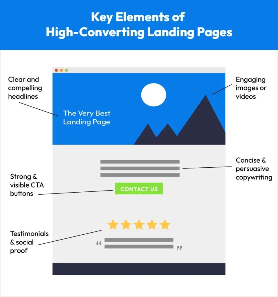
Now, let’s get into the core elements that are needed if you want to create landing pages that will get your customers to pull out their wallets and buy from you.
Clear and compelling headlines
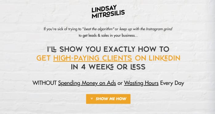
Your headline is the first thing visitors see, and it’s got to make an impact. Think of it as a friendly handshake, inviting them in.
The headline should be clear, making your offer obvious at a glance. But also, it needs a dash of excitement. Imagine your headline is like the title of a thrilling book. It should make your visitors curious to read on.
Use emotive words that grab attention and speak to your audience. Bolding or underlining one or two key words or phrases in your headline can also help to make it stand out and grab attention.
If you’re struggling to come up with a decent headline, then ChatGPT is a great tool that can help you with this.
For example, a great trick here is to give ChatGPT a headline that you’ve already come up with even if you’re not happy with it. Then, ask Chat to improve on it, making it catchy, engaging, and emotive. Don’t forget to tell ChatGPT who your audience is and what you’re selling (if that’s not clear from your starting point headline.
A great headline is like a promise. It tells your visitors what they can expect. Keep it short, sweet, and to the point. If your headline makes them nod and think, “Yes, that’s exactly what I need!” then you’re on the right track.
Engaging & Relevant Images or Videos
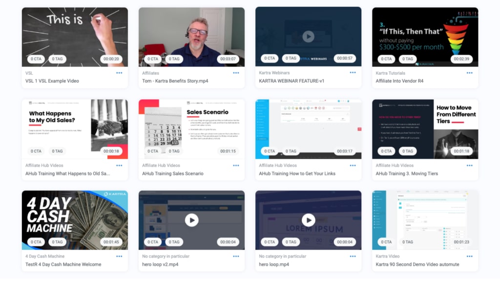
A picture is worth a thousand words, right? On your landing page, images and videos are your best friends. They grab attention and can explain things faster than text.
If you can, then one great tactic is to choose images that show real people using your product or service. This helps visitors picture themselves doing the same.
Videos can be even more powerful. A short, engaging video can tell a story quickly. It’s like giving your visitors a mini-tour of what you offer. Just make sure your images and videos are high quality and load fast. No one likes a blurry photo or a video that takes forever to play.
If your picture has a person or an animal in it, then a neat little trick is to point the nose of the prominent person or animal in the picture towards the ‘buy now’ button or ‘sign up’ form. his simple tweak is said to increase conversions considerably. Try it for yourself and see how it goes!
Concise & Persuasive Copywriting
Now, let’s talk about the words on your page. Your copywriting should be like a friendly chat. It’s not about using big, fancy words. It’s about being clear and speaking directly to your visitor’s needs. Keep your sentences short and easy to understand.
Your goal is to guide your visitors, step-by-step, towards taking action. Every sentence should have a purpose.
Whether it’s explaining a benefit, answering a question, or addressing a concern, your words should always be moving the visitor closer to that all-important click.
Strong & Visible Call-to-Action (CTA) Buttons
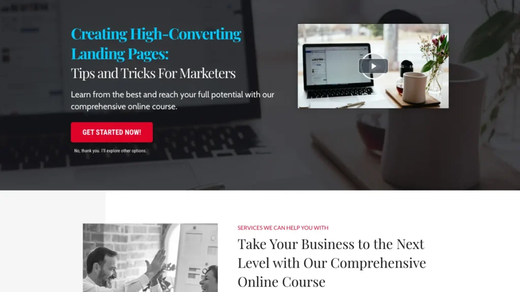
Your CTA button is like the finish line in a race. It’s what you want your visitors to click on to take the next step. Make your CTA buttons big and bold. Use colors that stand out, but still fit with the overall look of your page.
The words on your CTA button matter too. Instead of just saying “Click here,” try something more exciting. For example, “Get started now” or “Join the adventure” can be more enticing given the right context.
Testimonials & Social Proof
Last but not least, let’s talk about trust.
Testimonials and social proof are like your best cheerleaders. They show new visitors that other people have tried and loved your offer. Including quotes from happy customers, or logos of companies you’ve worked with can go a long way to building trust and increasing your conversion rate.
Seeing that others have had a great experience builds confidence. It’s like when a friend recommends a movie. You’re more likely to watch it, right? The same goes for your landing page. When visitors see that others trust you, they’re more likely to trust you too.
Video testimonials work great if you have some. If not, then work towards gathering a few. Screenshots of testimonials posted on platforms like Facebook and LinkedIn are also good. They help to show you have happy customers and a buzz around your brand.
Optimizing for User Experience
Now, let’s explore how to make your landing page not just good-looking, but also user-friendly.
Here are a few important bases you need to cover:
- Clean and intuitive layout
- Mobile responsiveness
- Page load speed
- Navigation
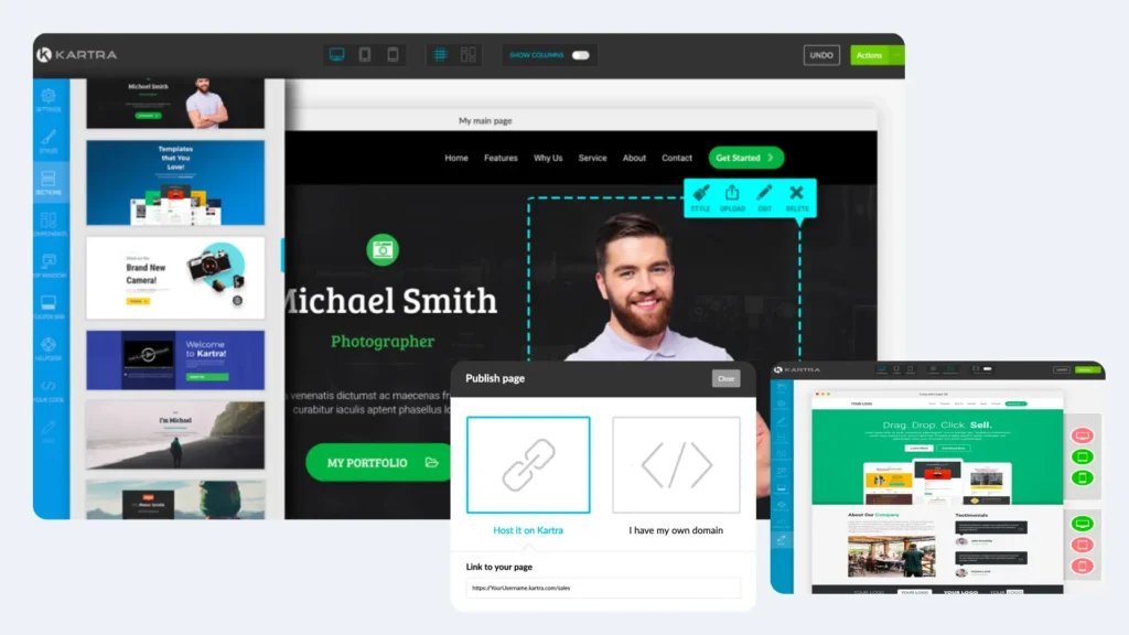
If you’re using Kartra to build your landing page then you can breathe a sigh of relief here. Kartra has all three of these elements baked into their software.
With a few tweaks you can easily layout beautiful-looking landing pages and check the responsiveness of your pages. As for page load speed, Kartra’s done all the heavy lifting for you, so you don’t have to worry about it.
With Kartra, you also have full control over the navigation element you choose to have on your page. This will help you to more easily direct your customers where you want them to go.
Clean & Intuitive Layout
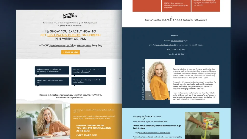
A clean layout means less clutter. Keep your design simple. Use plenty of white space to give your content room to breathe. This makes your page look organized and helps visitors focus on what’s important.
Your layout should also be intuitive. Arrange things in a way that feels natural.
Put important information where visitors expect to find it. Like a well-placed signpost, your layout should clearly and concisely tell the visitor what they need to know, and then guide visitors effortlessly towards your call-to-action.
Mobile Responsiveness
In today’s world, many visitors will be accessing your landing page using their phones. This means your landing page needs to look great and work well on mobile devices.
A mobile-responsive design adjusts your page automatically to fit any screen, big or small. Text should be easy to read without zooming in, and buttons should be big enough to tap with a finger.
This means you’ll be covered regardless if your visitors are viewing your page on a desktop, a tablet, or a smartphone.

Page Load Speed
When it comes to user experience, page load speed is critically important. And, with happy users who can find what they’re looking for quickly and easily comes increased conversions.
In fact, studies have shown that incremental improvements in page load speed have a direct impact on conversion rates. For example, Walmart found that for every 1 second improvement they made to their page load speed, their conversion rate increased by 2%.
Remember, even a few seconds can make a difference. A fast-loading page is like a smooth, open path with no obstacles. It invites visitors to keep going.
Page load speed can be a big headache for business owners and can cost them thousands if their pages aren’t loading quickly. With Kartra you have this headache since Kartra’s pages are designed with fast page load speed in mind from the get-go.
Navigation & Minimizing Distractions
Your landing page should have a clear path to your goal, with as few distractions as possible. Avoid adding unnecessary links or information that could lead visitors off your page.
Your navigation should be simple and straightforward. If you have a menu, keep it minimal. Your landing page should have one goal in mind depending on what you’re using it for – either to collect leads or to sell a product. So, if you’re using a menu on the landing page, then just make sure that it doesn’t lead the visitor away from your goal.
The aim is to gently guide your visitors to your call-to-action, not to give them multiple options. It’s about removing any hurdles that could trip them up on their way to the finish line.
Leveraging A/B Testing for Improvement
A/B testing is a powerful weapon that you shouldn’t overlook. It’s the compass that guides you to what really works.
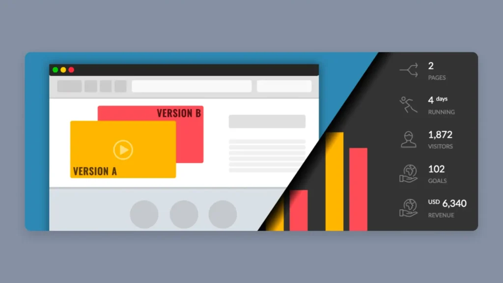
In a nutshell, A/B testing involves comparing two versions of your page to see which one performs better. However, it’s important that you only test one element at a time so you can get clear data on what is working and what is not.
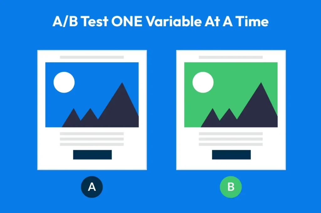
So, start by choosing one element to test. Maybe it’s your headline, an image, or your call-to-action button. Change just one thing in the second version. This way, you know exactly what caused any difference in performance. Imagine you’re a chef tweaking a recipe. By changing just one ingredient at a time, you can tell which one made the cake tastier.
Now, show these two versions to different groups of visitors. This is where the magic happens. Track how each group reacts. Which version leads to more clicks or sign-ups? These results are like clues in a treasure hunt, leading you to what your audience prefers.
Remember, A/B testing isn’t a one-time thing. It’s an ongoing journey of discovery. Each test teaches you something new about your audience. Over time, these insights add up, helping you craft a landing page that hits the mark more often than not.
Also, don’t be afraid to test big changes. Sometimes, a bold move can lead to a big leap in performance. Other times, it’s the small tweaks that make a big difference.
Integrating with Marketing Funnels
Integrating your landing page with your overall marketing funnel is crucial. Think of your marketing funnel as a journey your customers take, from first hearing about you to finally making a purchase. Your landing page is a key stop on this journey. It needs to fit into the bigger picture and guide your visitors smoothly to the next step.
First, align your landing page message with the specific stage of your funnel. If your visitors are just learning about your product, the page should educate and inform. For those closer to buying, focus on persuasion and strong calls-to-action. This alignment ensures that your message meets your visitors where they are in their decision-making process.
Next, consider how your landing page connects with other marketing efforts. If someone clicks on an email link or a social media post, the landing page they arrive at should reflect the promise made in that link or post. This consistency builds trust. It’s like making a promise and then keeping it.
Also, think about the after-landing-page experience. What happens once someone fills out a form or clicks a button? Plan this follow-up journey carefully.
Whether it’s a thank you page, an email sequence, or a phone call, this follow-up is a critical part of the experience. It’s your chance to deepen the relationship and move the visitor further down the funnel.
Lastly, don’t forget to gather data from your landing page and use it to refine your marketing funnel. Track how visitors interact with your page and where they go next.
Advanced Tips and Tricks
To really make your landing page stand out, you can use some clever techniques. These are like the secret ingredients that give your page an extra edge.
Here are three important tips for you to sprinkle in:
Psychological Triggers
Using psychological triggers is a smart way to encourage visitors to act quickly. Urgency and scarcity are two powerful tools. When something feels urgent or scarce, we’re more likely to want it.
You can create urgency with limited-time offers or countdown timers. It’s a bit like when a store has a sale that ends soon. You feel the need to buy before it’s too late. Again, if you’re using Kartra, then this is super-easy to do since Kartra has these tools baked in and ready for you to use.
Scarcity can be shown by displaying limited stock. It’s the feeling you get when there are only a few tickets left to a concert. You rush to buy because you don’t want to miss out.
These triggers tap into our natural desire to grab good opportunities when we see them.
Color Psychology in Design
Colors do more than just make your page look pretty. They can actually affect how people feel. This is known as color psychology.
For example, blue can make your page feel trustworthy and calm. Red can create a sense of excitement or urgency.
Choosing the right colors can set the mood for your page. It’s like choosing the right outfit for an occasion. You want the colors to match the message you’re sending.
Personalization and Dynamic Content
Personalization means making your visitors feel like the page was made just for them. You can do this by using their name if you know it, or showing content that matches their interests.
Dynamic content changes based on who is viewing the page, which is pretty awesome. And before you ask, yes, Kartra landing pages have this feature too.
Imagine your page is a chameleon, changing its message to match each visitor. This makes each person’s experience unique and more engaging. It’s like having a conversation where you talk about things the other person really likes. They’re more likely to stay interested and engaged.
Creating High-Converting Landing Pages: Final Thoughts
There you have it! Crafting a high-converting landing page is a blend of art and science.
It starts with understanding your audience and is perfected through key elements like compelling headlines, engaging visuals, and intuitive design.
Optimizing for user experience and leveraging A/B testing are crucial for continuous improvement. Advanced techniques like psychological triggers and personalization add the final touch, making your page not just a stop but a memorable journey for your visitors.
Get started with Kartra today and explore the power of its landing page features. Start creating pages that don’t just attract but also convert and captivate your audience.
About the author
Steve West is the founder of entrepreneurnut.com. He’s been working online since 2013 and specializes in SEO, YouTube, and affiliate marketing. Off-screen, he’s all about hiking, staying fit, martial arts, and a cheeky love for cookies.

About Kartra
This blog is brought to you by Kartra, the all-in-one online business platform that gives you every essential marketing and sales tool you need to grow your business profitably – from sales pages and product carts to membership sites, help desks, affiliate management and more. To learn how you can quickly and easily leverage Kartra to boost your bottom-line, please visit kartra.com.

