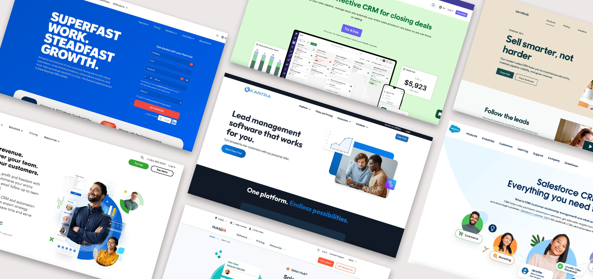
From consultants to creatives to influencers, individuals who create a personal website have the power to grow a small business and build a brand their way.
Unlike social media platforms, personal websites give you complete creative control over your online image!
Here at Kartra, we’re passionate about giving people the tools they need to turn their unique experiences and knowledge into a powerful brand — one that makes an impact on others and frees you up to do the work you love.
Let’s take a look at how to build a personal brand website that makes a great impression on your audience. We’ll look at multiple pages of just one website to see how to implement these ideas across a single website –and then we’ll analyze 7 personal brand website examples to see how they put these principles into practice!
Start with your pitch
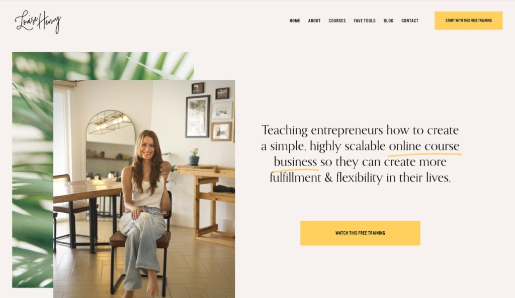
Online Business Expert Louise Henry’s Website: louisehenry.com
Every website has to have a homepage. But what goes into making this important landing page stand out, and how do you move visitors beyond the front door into the rest of the site?
It all begins with your personal brand statement. This should be a short, simple, and to-the-point communication about who you are, what you do, for whom, and why. That’s a lot of information to pack into one or two sentences, but it’s worth the effort!
This is your chance to capture your audience’s interest and convince them you’re worth listening to.
Try following this formula.
Personal brand statement template
[Name]: [Title]
I help [target customer] [goal-based verb statement] by [verb statement]
Example:
John Smith: Designer
I help new businesses break into the market by designing cutting-edge logos and websites.
And since this is, after all, a personal brand website, visitors will want to see the person behind the pitch. The best designs make “eye contact” with site visitors by featuring personal professional photographs—relevant to your industry of course—right on the homepage. Don’t make them dig to figure out who they’ll be working with.
Guide visitors with clear calls to action

Louise Henry’s free live webinar landing page used as a lead magnet
Make sure each landing page (and especially the homepage) includes a clear and prominent call to action (CTA). Whether your goal is for site visitors to contact you for a quote, book an appointment, subscribe to your podcast, or shop your best-selling products — it’s vital that potential customers can quickly identify how to take the next step.
One word of caution —
Too many competing CTAs on the homepage can be confusing and might actually reduce conversions! The best personal brand websites focus on the main goal and make it easy to navigate the site so visitors can find the rest of the content on their own.
Want more engagement on your website? Check out these expert tips for creating high-converting landing pages.
Feature testimonials from happy clients
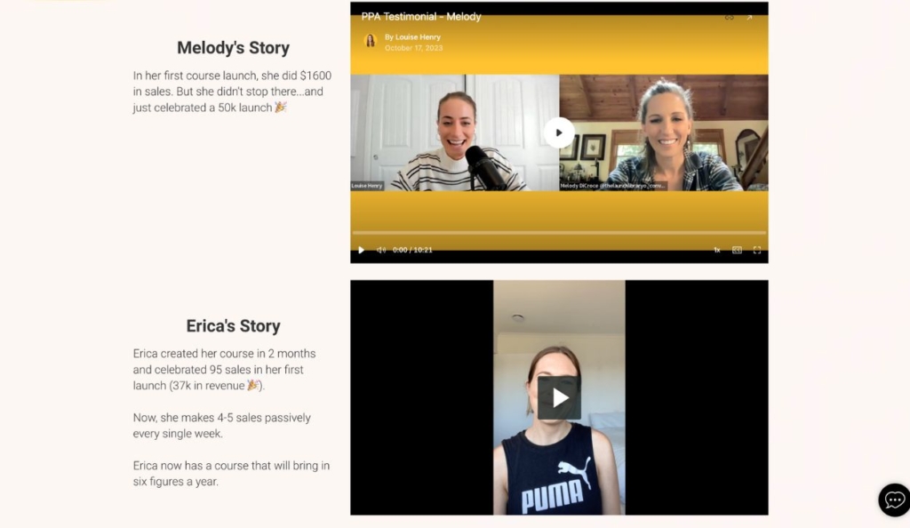
Testimonials from the Passive Profit Accelerator course
Whether you dedicate a page to testimonials and case studies or you feature them throughout your website, you need “social proof” to build trust with potential clients and back up your brand. If you don’t have testimonials already, don’t sweat it. Just make sure to ask for client feedback and quotes at the end of each project and add them to your site as you’re able.
Create an “about” section that resonates with future clients
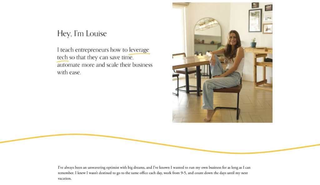
Louise Henry’s about page highlights her mission and backstory
An “about” section is key to connecting with your audience and going deeper into who you are, what you do, and why you do it — even if you already have a killer personal brand statement.
Your bio can be placed on your main page or on a separate page. It can be a simple paragraph, a series of “fun facts,” a video of you, or whatever format you’d prefer.
The thing to note here is you can (and should) reflect who you really are!
When someone hires or purchases from an individual, they aren’t just shopping for services or products they could probably find from dozens of businesses. They want to hire a real, live human being. They want connection, a personal touch.
Use your about section to tell your personal story, share details about yourself that may not be directly work-related, and let people get a sense for your personality. Highlight the details that are most relevant to your brand’s message and mostly likely to strike a chord with your audience.
Make it easy to contact you
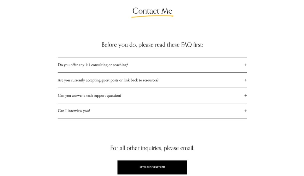
Louise Henry’s contact page features FAQs and a simple button for email contact
It shouldn’t be a hassle to find your contact information. Sometimes people will go directly searching for your personal site. But other times, they may find it while searching for the type of services you offer or discover your site while browsing the internet. However they find you, make it as easy and intuitive as possible for potential customers to reach you.
There are a few ways to go about this, depending on the products or services you offer and how much you want to know about potential customers before communicating with them directly.
The most straightforward option is to include your direct contact information on your site. This should include a professional email address as well as your social media profiles.
Another option is to include a contact form on your page where visitors can send you a message directly through your site. The contact form can be as simple or detailed as makes sense for your business. Even if you plan to provide direct contact information, we recommend having a contact form as an alternate method. It’s just convenient!
If you offer appointments or consultations, you can also add a calendar right to your contact page so people can immediately schedule a time with you.
Bonus: Optimize your site to be SEO friendly
Before you dismiss Search Engine Optimization (SEO) as something that only big companies do, know this:
93% of online experiences begin with a search engine. And the top three ranking search results get about one-third of the total search traffic. So it literally pays to be at the top. Here are a few best practices for building an SEO-friendly website.
- Use the words and phrases your audience is likely to search: In SEO, a “keyword” is a specific search query internet users search such as “New York City photographer” or “small business consultant.” Each page of your website should have a target keyword that distinctly matches the phrasing your customers would type into Google.
- Choose strategic meta titles: Your page title, or “meta title,” is the text that appears in blue on a Google search result page when your website shows up. The key here is to choose a title that includes your page’s exact target keyword, while also making it unique to you so that it attracts attention.
The meta title should be as concise and accurate as possible – only about 60-70 characters will show up on a Google listing. This can be something as simple as [YOUR NAME] [PROFESSION], or something like: Expert [PROFESSION] in [CITY]. If you can, add adjectives like “affordable” or “professional” or “reliable” to make it stand out. - Write accurate and compelling meta descriptions: Your meta description is that little blurb of text (under 160 characters) that appears under the title in a search result. This should be a summary of your page and—you guessed it! should include your exact keyword as well.
- Make each page as helpful and relevant as possible: A common misconception about SEO is that it’s all about technical tricks and hacks. Ultimately, search engines are there to give users the best possible results for their search. If you want to be the go-to website in your industry, you need to give your audience the quality content and information they’re looking for! From meta titles to blog content, the goal of optimizing your website for SEO is to meet the needs of your audience.
Learn more about how SEO works in our guide for content creators
7 personal brand website examples
Let’s see how entrepreneurs from different fields are using these principles to develop their own personal-branded websites.
Emily Osmond: Marketing mentor and speaker
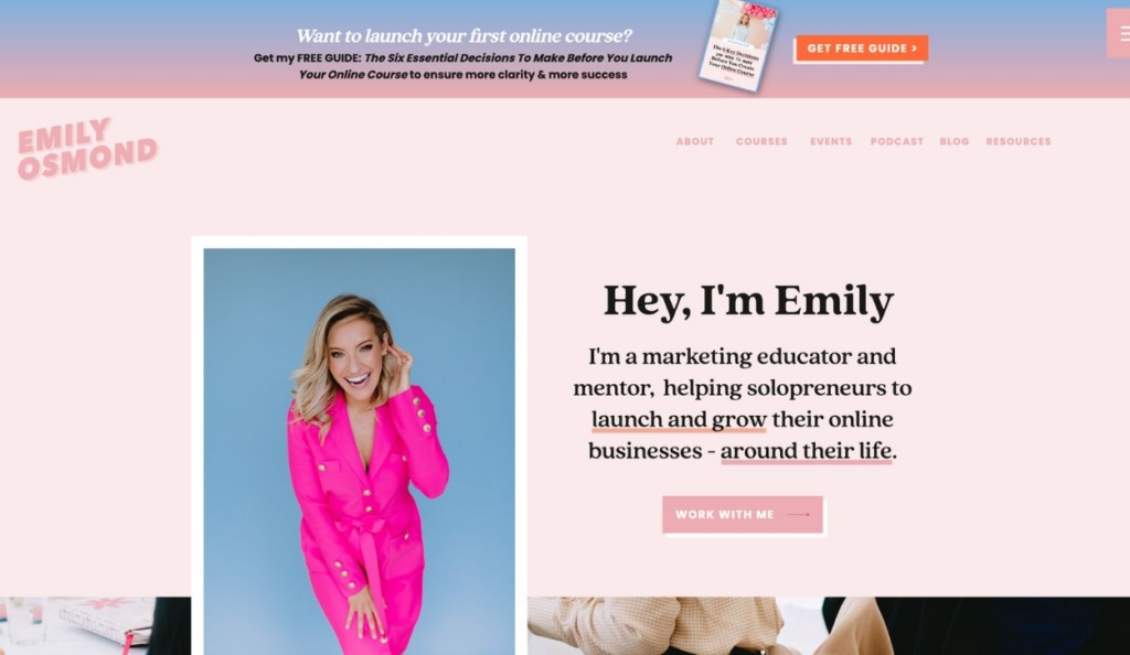
Emily Osmond’s website engages visitors with a vibrant color scheme, bold fonts, and high-quality photography — every design element conveys her personality and establishes the tone for her business. She’s also crystal clear about what she does and who her target audience is. This website design is a great example of how a brand identity can be fun and personal while still conveying value and professionalism.
Camille DePutter: Communications coach
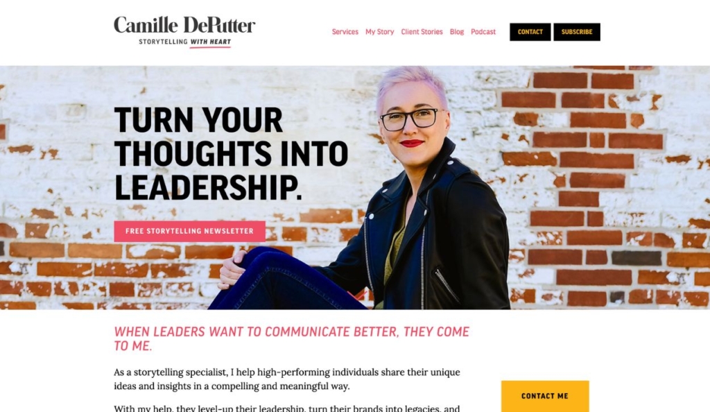
Camille DePutter’s homepage immediately connects the user’s needs with her expertise. Speaking from the user’s perspective, she establishes how she will use her communications mastery to elevate others’ success. The excellent writing throughout reinforces her expertise. Notice how she integrates all of the recommended website elements with an optimistic, encouraging, can-do tone which creates a strong personal brand.
Jonathan Goodman: Business coach
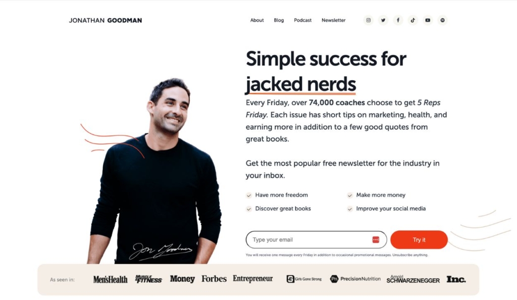
In the first few seconds on Jonathan Goodman’s website, you know exactly who he serves, that he is an industry leader, and what action you should take. His heading is creative but clear, and it’s formatted to emphasize his specialty. Additionally, he offers two lead magnets on the first page with wording that is enticing but not pushy. As he dives into his services, he sets up a clear problem/solution framework for the health and fitness professional.
Jen Moore: Photographer
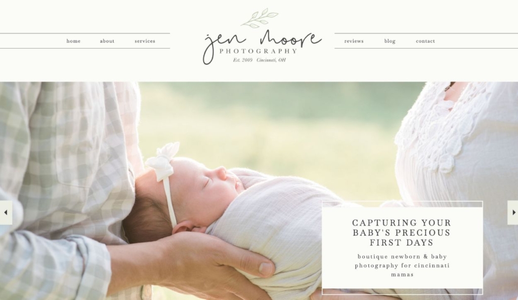
Jen Moore takes a people-first approach to photography that is evident immediately on her website. Her homepage features a clear and engaging headline coupled with a carousel of newborn photographs to highlight her work. The about page further connects to expectant parents through her own parenting experience. Jen doesn’t just describe her business, she creates a cohesive brand image that accurately conveys who she is and what clients can expect.
Melanie Everett: Realtor
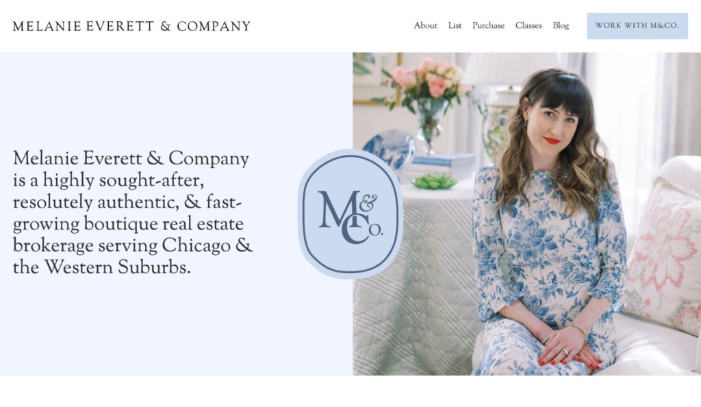
Real estate brokerage founder Melanie Everett integrates all of the key components of an effective personal brand website — beginning with her homepage that features an engaging personal photograph and a short, clear, well-written elevator pitch. Social proof is woven throughout the web design, and excellent photography reinforces her real estate expertise.
Gonzalo Jimenez: Business and funnel strategist

Gonzalo Jimenez incorporates candid photography on his personal brand website, looking toward the text instead of “facing” the website visitor. This tactic draws the reader’s eyes to his message. He feels approachable and friendly and builds trust with his audience by incorporating lots of social proof — written testimonials, videos, and hard numbers that prove his strategies work. This website is simple and straightforward, focusing on the details that matter.
Patrice Washingston: Finance and well-being coach
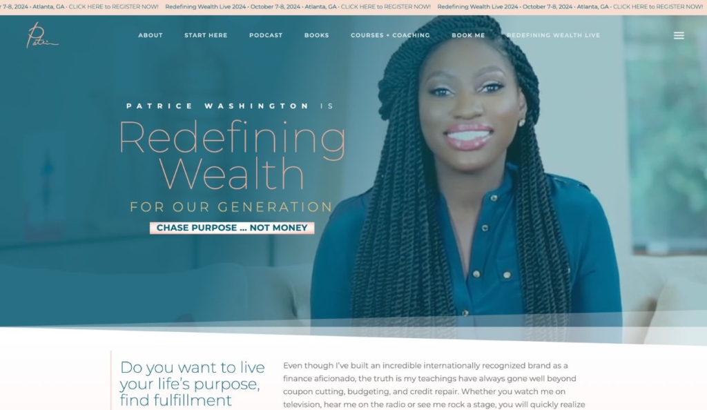
Patrice Washington creates an engaging user experience on her personal brand website, with videos, interactive elements, and a distinct brand voice. This site proves just how many ways you can leverage your online presence to drive actual revenue. After introducing herself and what she does for others, Patrice guides website visitors to check out her podcast, books, online courses and coaching services, membership, and speaking engagements.
Take your personal brand website to the next level with Kartra
Whatever your niche, Kartra offers solutions to establish and grow your personal brand.
Our all-in-one platform provides digital marketing tools that enable you to build a bigger following and monetize your website through online products and services — whether you’re starting from scratch or it’s time to expand your reach.
- Drag-and-drop page builder
- Page templates
- Email marketing
- Appointment booking
- Checkouts
- Membership site software
- Videos and webinars
- Sales funnels
Already have a website builder you use? Kartra integrates with tools like WordPress or Squarespace so you can effortlessly take your brand to the next level.

