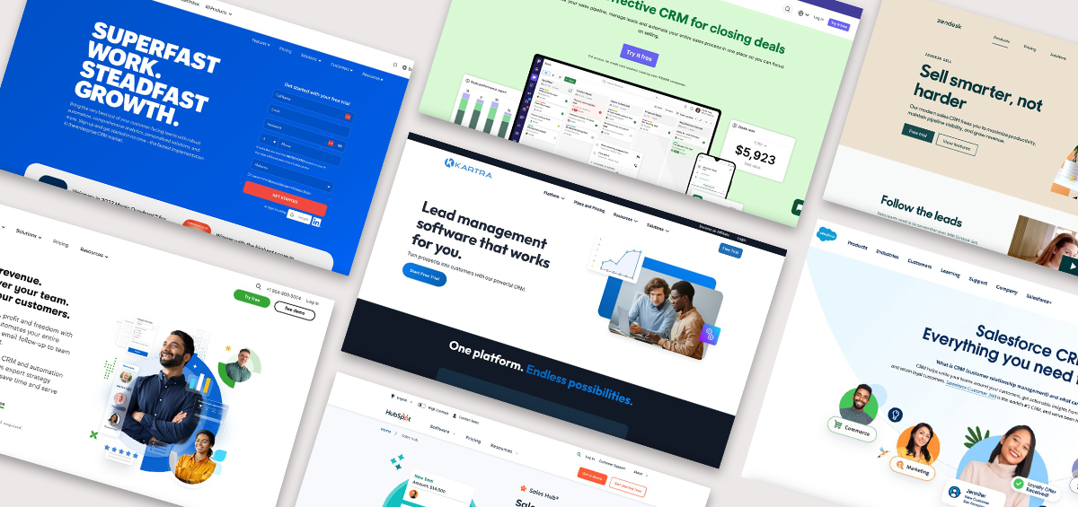
Your website needs to successfully convert leads into customers, which means you need effective landing pages. The landing page is the last stop — the place where your potential customer decides to take action!
In this guide, we’ll look at great landing page examples across many different industries and types of online brands, so you can find inspiration and valuable advice for your own landing pages. Pay attention to how each brand on this list uses its landing page to build trust with the audience and persuade them to take the next step.
Online course landing page examples
1. Louise Henry
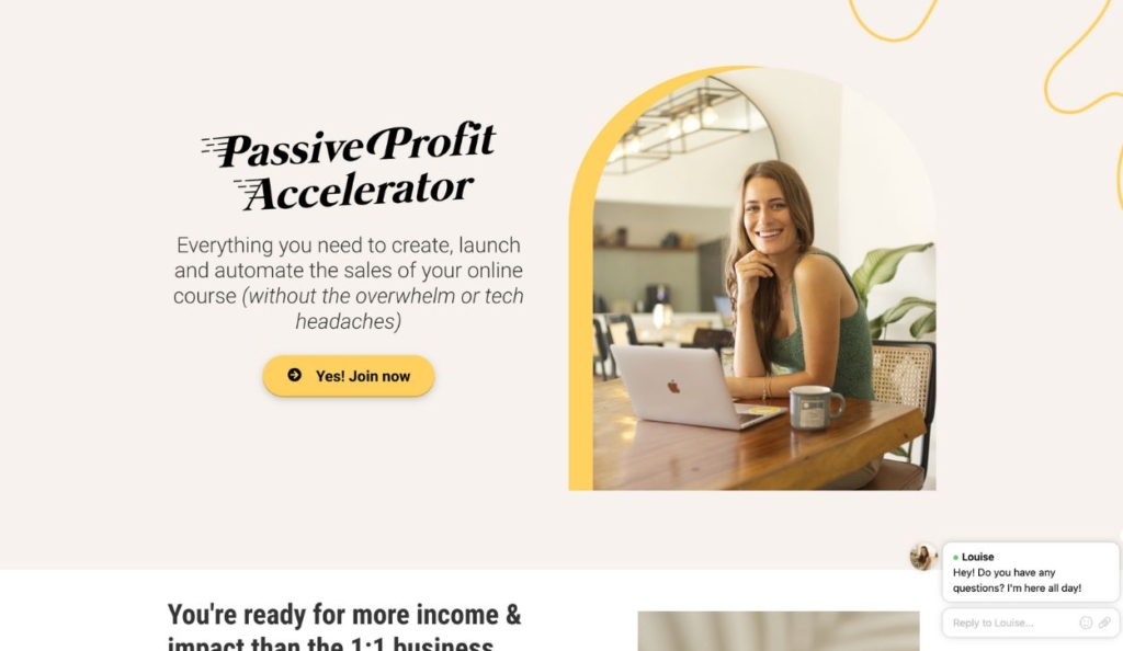
Louise Henry’s landing page for the Passive Profit Accelerator course
This landing page on Louise Henry’s website encourages users to sign up for her online course and sales system called the “Passive Profit Accelerator” — teaching entrepreneurs how to create, launch, and automate their own online courses.
What stands out
- Louise Henry uses language that resonates with her audience’s goals and pain points (e.g. “tech headaches”, “maxed out”, “more freedom and flexibility than ever”)
- Visitors are presented with comprehensive details about what the course includes, so they can make an informed decision
2. Dr. Kim Foster
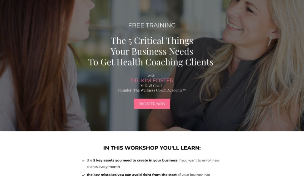
Dr. Kim Foster’s free workshop landing page
Dr. Kim Foster uses this course landing page to promote her free workshop for health professionals, teaching them strategies to attract more clients and grow their practices.
What stands out
- Dr. Foster provides specific examples of client success to build credibility with her audience
- The copywriting on this landing page generates interest through a sense of exclusivity and mystery “the secret weapon for the success of your business (that most people completely overlook)”

Build high-performing landing pages that attract leads and grow your email list
3. Stefanie Lugo
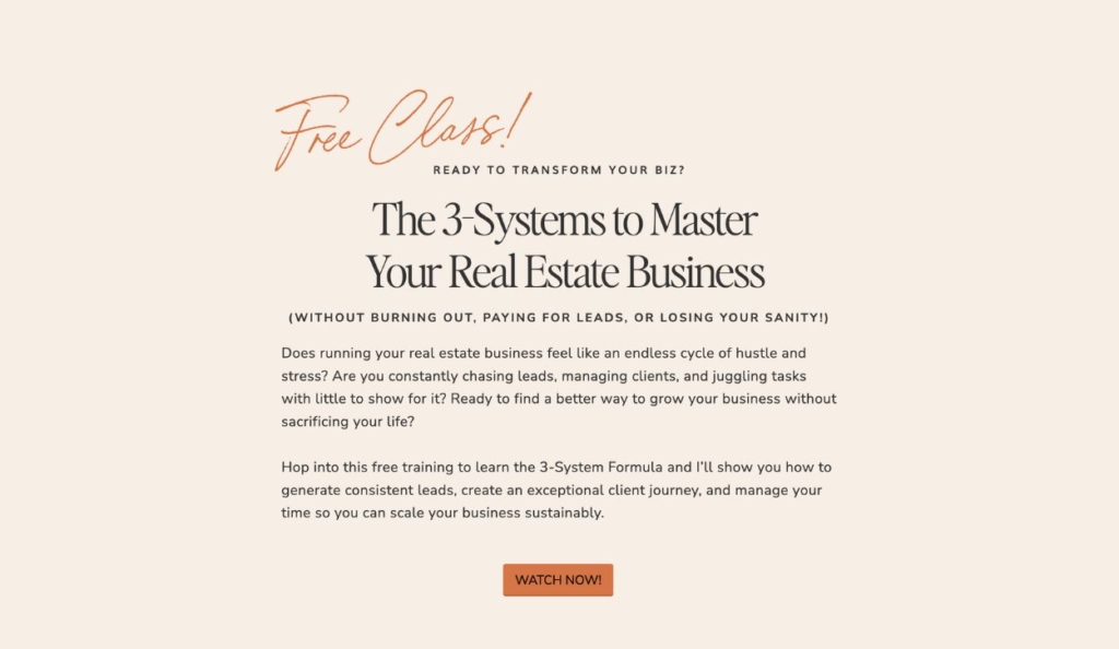
Landing page for Stefanie Lugo’s free 60-minute class
This course landing page from real estate coach Stefanie Lugo promotes a free, 60-minute class that helps real estate agents grow their businesses through digital marketing techniques and administrative best practices.
What stands out
- This landing page design is simple and easy to navigate while still covering all the important details — who the training is for, what it’s about, why the user should sign up, and who is teaching the information
- Stefanie maintains a friendly but professional brand tone that is consistent with the rest of her website
4. Joyful Parents
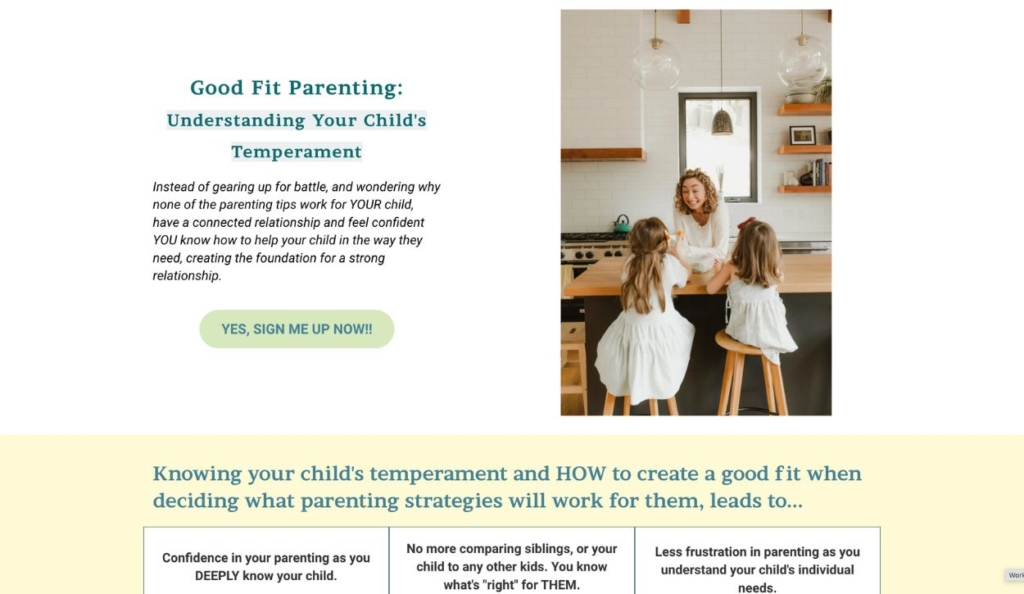
Landing page for the Good Fit Parenting course from Joyful Parents
Parenting Coach Myla Leinweber of Joyful Parents offers an online course that helps parents understand their child’s temperament so they can apply the best parenting strategies. This landing page explains what the course accomplishes and encourages visitors to sign up.
What stands out
- This landing page incentivizes the client to purchase the course by painting a picture of their life before and after they take the course
- The sneak peeks of course materials build interest and demonstrate value
5. Business Made Simple
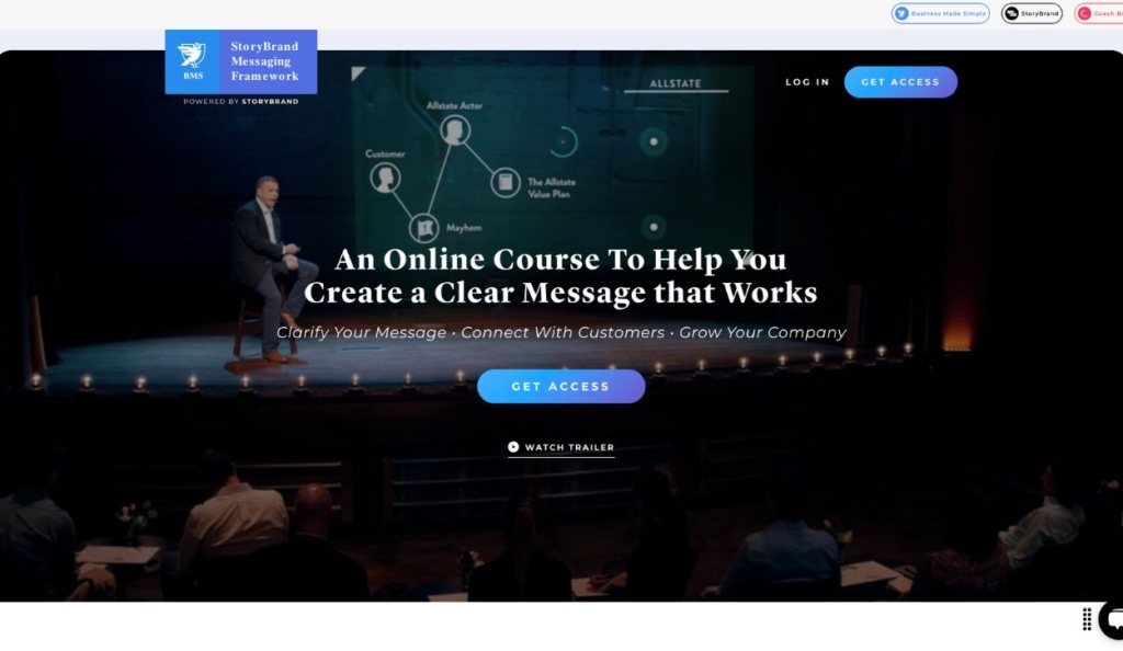
Landing page for the StoryBrand Messaging Framework course
This landing page from Business Made Simple promotes the StoryBrand Messaging Framework course, which helps businesses clarify their messaging to improve marketing effectiveness.
What stands out
- The “watch trailer” option gives potential customers an engaging preview of the course
- The landing page inspires action by appealing to audience pain points and FOMO (e.g. “The StoryBrand Framework is Used by the World’s Top Brands Plus Over 10,000 Small Businesses”)
6. Justin Welsh
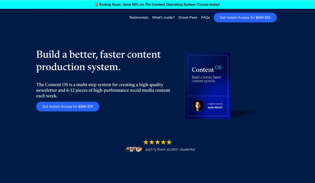
Landing page for Justin Welsh’s digital course, “The Content OS”
Justin Welsh is a well-known solopreneur and content creator who teaches people how to create and scale successful businesses online. This landing page promotes Justin’s online course on producing high-quality content for newsletters and social media.
What stands out
- This landing page demonstrates the power of concise copywriting that gets to the heart of the audience’s goals (e.g. “build a better, faster content production system”)
- The landing page design accommodates users who skim, jump between sections, or who scroll for more information — making sure everyone gets the information they’re looking for
Check out these tips and tricks for building successful landing pages
7. Loves Data
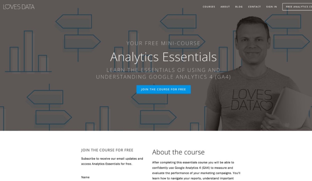
Free mini-course landing page from Loves Data
This landing page from Loves Data promotes an online course that teaches users how to effectively use Google Analytics to make data-driven business decisions.
What stands out
- The simple sign-up form ensures a low barrier to entry
- The clean landing page design makes it easy to find important information about the course and the course instructor
8. Girls Gone Strong
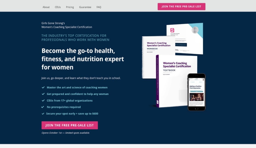
Women’s Coaching Specialist Certification pre-sale landing page from Girls Gone Strong
This pre-sale landing page offers early access and discounted pricing for the Girls Gone Strong Women’s Coaching Specialist Certification program.
What stands out
- Sign-ups are encouraged through a sense of urgency (“limited spots available” “secure your spot early”)
- The landing page includes a clear outline of the program benefits, backed by social proof and detailed information about the course’s credibility
9. Wizard of Odd Marketing
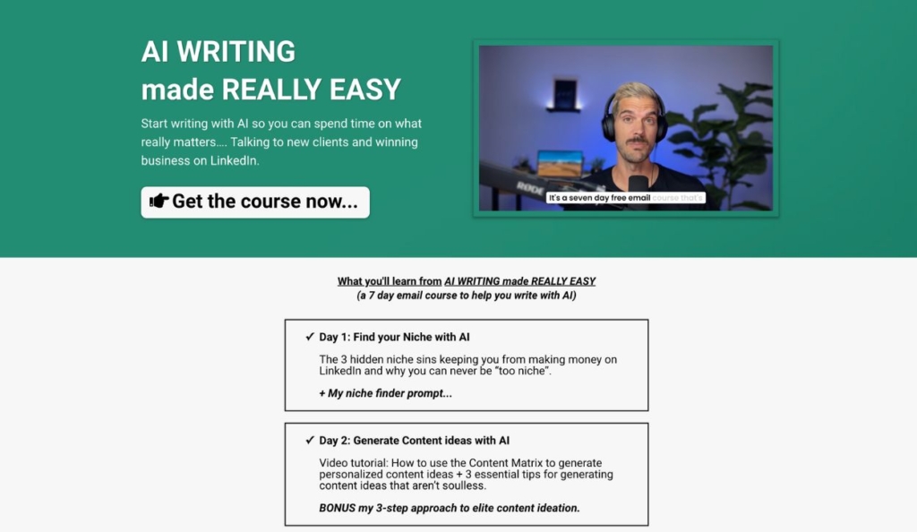
Landing page for Wizard of Odd Marketing’s email course on AI writing
This landing page promotes an email course from Wizard of Odd Marketing that teaches people how to write with AI so they can use their time effectively and win new clients on LinkedIn.
What stands out
- The simple value proposition at the top of the page makes it immediately clear what the course is about and why it matters
- The video on this landing page enables the course creator to connect with their website visitors in a more personal way
10. Simon Sinek
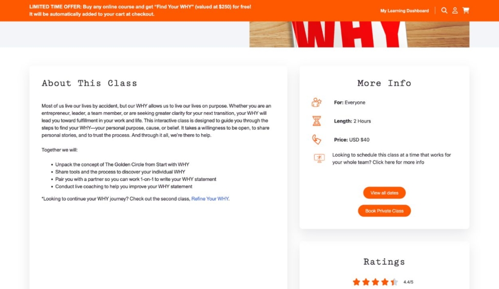
Landing page for the “Start with WHY” class from Simon Sinek’s Optimism Company
Simon Sinek is a world-famous leadership expert and motivational speaker. This landing page offers an online class with one of Simon Sinek’s Master Trainers, based on his “Start with Why” concept.
What stands out
- The simple landing page design makes it easy for visitors to see all the information that they need — including the course price and course length.
- A comprehensive FAQ section helps to ensure customer satisfaction by setting course expectations and anticipating needs
Coaching landing page examples
11. Libby Munro Nutrition
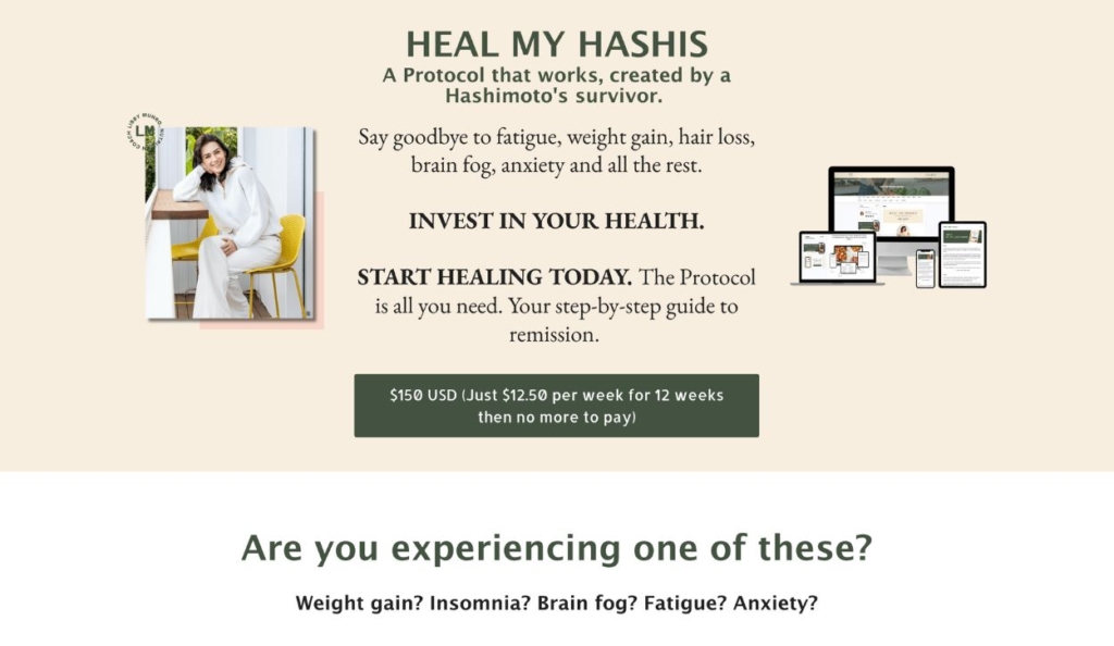
Landing page for Libby Munro’s 12-week program
Health coach Libby Munro offers a program that helps individuals with Hashimoto’s disease heal through nutritional and lifestyle guidance. Website visitors can sign up on this landing page.
What stands out
- The price of the program is easy to see and broken down into a weekly rate that feels more affordable than a lump sum
- The coach provides detailed background information about her story and the course, building trust and setting expectations for the program
12. Nutrition for Life Project
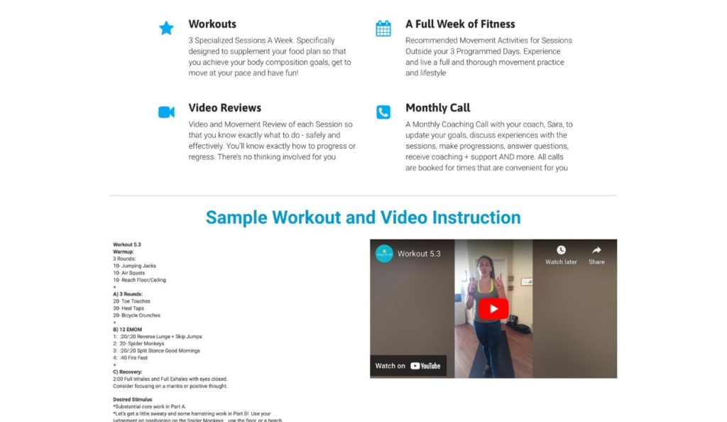
Landing page for a monthly fitness program from the Nutrition for Life Project
This Nutrition for Life Project landing page promotes a monthly fitness regimen, including weekly sessions and a monthly coaching call.
What stands out
- The sample workout and video give visitors a feel for the coaching program
- Straightforward contact information at the bottom of the page (an email and phone number) makes it easy for users to ask questions and get further information
Check out these 31 marketing strategies for online coaches
13. Wealth Over Now
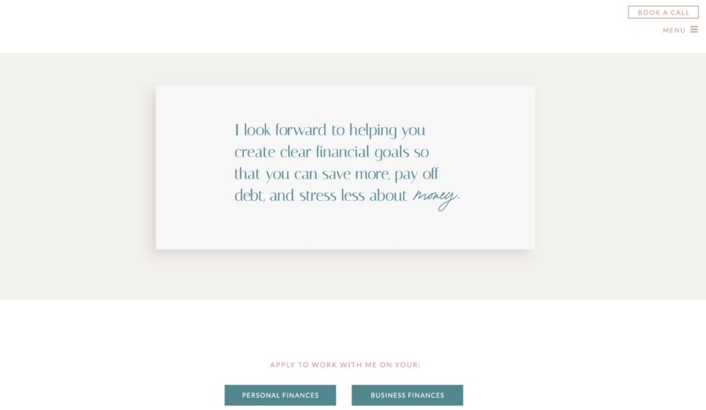
Appointment landing page for financial coaching services by Wealth Over Now
This appointment landing page from Wealth Over Now enables visitors to schedule a call for personal or business financial coaching services.
What stands out
- The heading reiterates the purpose of the financial coaching services, helping to make sure everyone is on the same page as they go into the initial call
- The interactive landing page design creates a clear distinction between the two types of coaching services
14. Eliana Goldstein Coaching
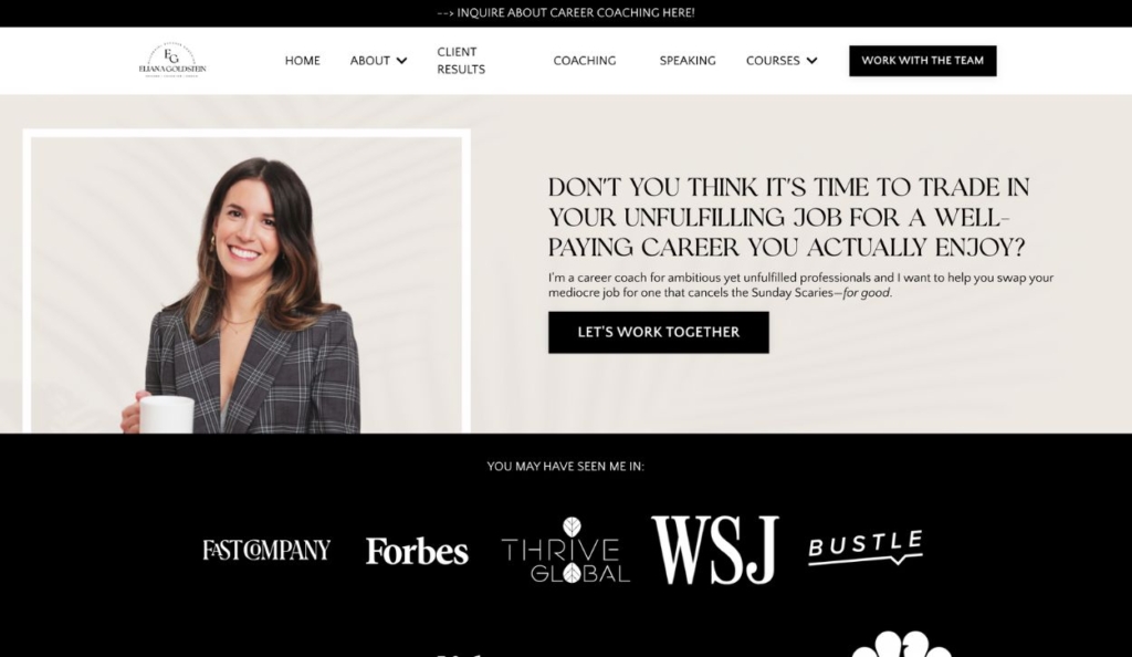
Homepage of Eliana Goldstein Coaching
This homepage for Eliana Goldstein Coaching functions like a landing page, immediately displaying a clear value proposition, call to action, and even social proof.
What stands out
- The creative design of this landing page makes it easy to quickly see all the most important information about the coaching services without the page being cluttered or overly text-heavy
- The copywriting motivates action by addressing specific pain points (e.g. “imposter syndrome” “discontent” “bored” “unfulfilling”) and promising a solution
15. Luisa Zhou
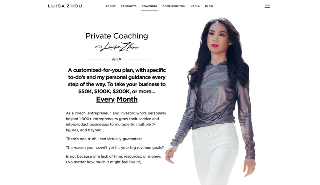
Luisa Zhou’s landing page for private business coaching
This landing page on Luisa Zhou’s website offers private coaching programs for entrepreneurs who want to sustainably scale their own coaching businesses.
What stands out
- This landing page is lengthy and detailed, which is fitting for Luisa Zhou’s high-ticket, exclusive coaching programs that clients must apply for and be accepted into.
- Unlike low-barrier, low-commitment sign-up forms that only request a name and email, the detailed application forms for Luisa Zhou’s coaching programs help make sure that only serious applicants take the next step
16. Tony Robbins
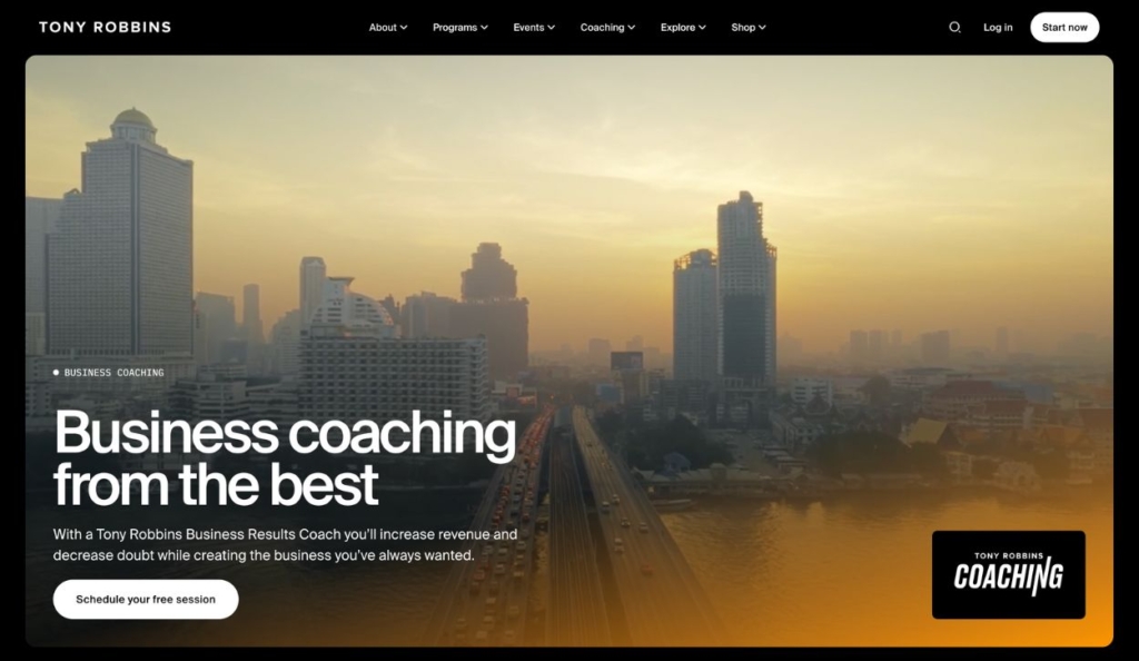
Landing page for Tony Robbins’ business coaching
This landing page promotes Tony Robbins’ business coaching program, designed to help entrepreneurs and business owners achieve sustained growth and success.
What stands out
- This landing page inspires action primarily by appealing to the audience’s values and goals (e.g. “increase revenue”, “create a competitive edge”, “maximize business success”)
- Tony Robbins reaches a wide audience with his coaching philosophy, but this landing page is designed and written specifically for professionals
17. CEO Coaching International
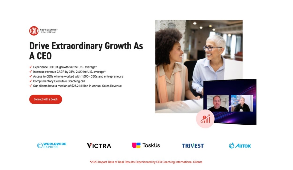
Ad landing page for CEO Coaching International’s executive coaching services
This ad landing page from CEO Coaching International encourages executives to sign up for a call to discuss one-on-one coaching programs.
What stands out
- The landing page leads with specific benefits and hard numbers to back up their claim that CEOs can “drive extraordinary growth” with the help of their coaching services
- The page strategically nurtures leads toward a decision by overcoming objections, providing social proof, and offering a low-commitment next step (“Talk to the experts at CEO Coaching International”)
Learn how in our 7-step guide
Webinar landing page examples
18. Dana Stevens Coaching
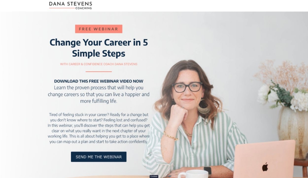
Dana Stevens’ free webinar landing page
This landing page from Dana Stevens Coaching promotes a free webinar on how to successfully transition careers by offering actionable steps for professionals seeking change.
What stands out
- This simple landing page design demonstrates that you don’t need a complicated site to create a professional user experience and offer helpful resources to website visitors
- Using original photography (instead of stock photos) builds trust with the audience and gives them a sense of the coach’s personality
19. Tobi Oluwole
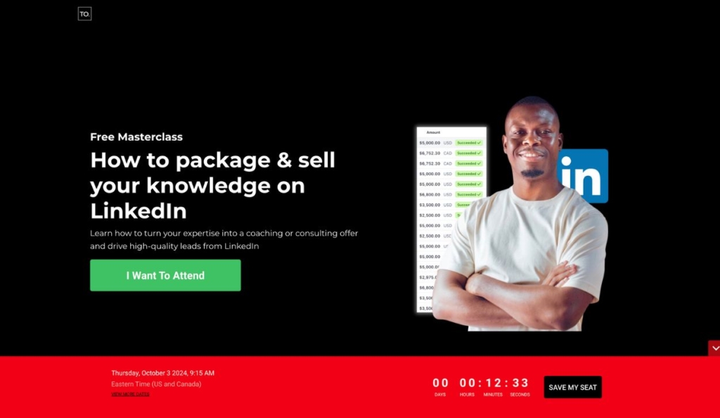
Landing page for Tobi Oluwole’s free masterclass
This landing page promotes Tobi Oluwole’s free online webinar for entrepreneurs who want to sell their expertise on LinkedIn.
What stands out
- The red footer creates a sense of urgency to reserve a spot, staying on-screen as the visitor scrolls
- Tobi uses a timeline format to share his story in an engaging way and prove his authority on this webinar topic
20. Canva
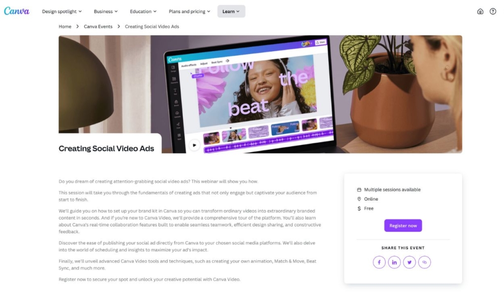
Landing page for a free webinar hosted by Canva
Canva website visitors can register for a free webinar on “Creating Social Video Ads” through this landing page.
What stands out
- The bright purple registration button and social media icons encourage sign-ups and social shares
- This simple landing page design makes it clear what the event is about, who is speaking, where the event is held (online), and how much it costs (free!)
21. The Marketing Meetup
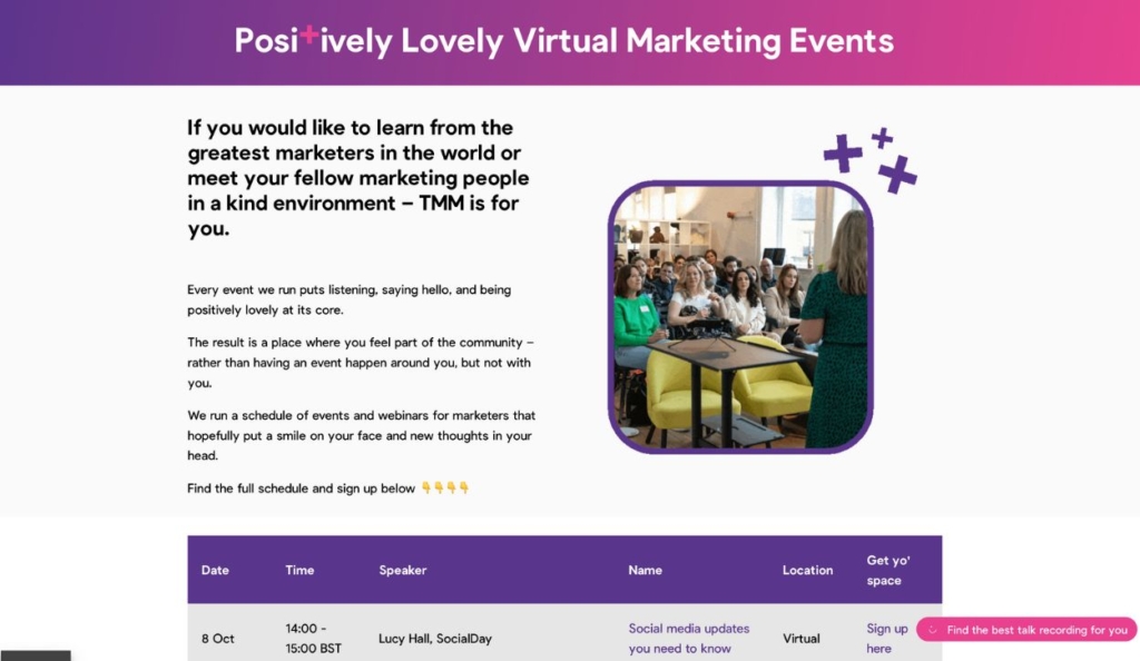
Landing page for virtual events hosted by The Marketing Meetup
The Marketing Meetup presents a variety of virtual events on this landing page, giving visitors an overview of the events and links to sign up for specific sessions.
What stands out
- This landing page motivates users to participate in the events by emphasizing values — such as joy, kindness, and community — instead of deep-diving into webinar specifics
- The schedule format on this landing page makes it convenient for visitors to sign up for one or multiple events
Find expert advice on hosting a successful online event
22. NP Digital
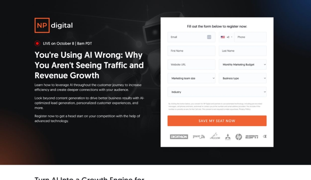
Landing page for a live webinar hosted by NP Digital
This webinar landing page from NP Digital invites users to a live webinar on common mistakes in using AI for marketing and how to correct them for better business outcomes.
What stands out
- The attention-grabbing heading (“You’re Using AI Wrong”) creates interest in the event and motivates website visitors to keep reading
- The registration form creates a sense of exclusivity and value by featuring social proof and encouraging users to “save my seat” instead of “sign up”
23. Jenna Kutcher
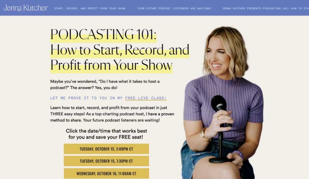
Landing page for Jenna Kutcher’s live class on podcasting
Jenna Kutcher uses this landing page to promote her free webinar on how to host a successful podcast.
What stands out
- The bold color palette on this landing page is consistent with Jenna’s overall web design and brand tone
- Multiple webinar dates and times maximize sign-ups by providing multiple options and making the user feel their schedule is respected
24. Amy Porterfield
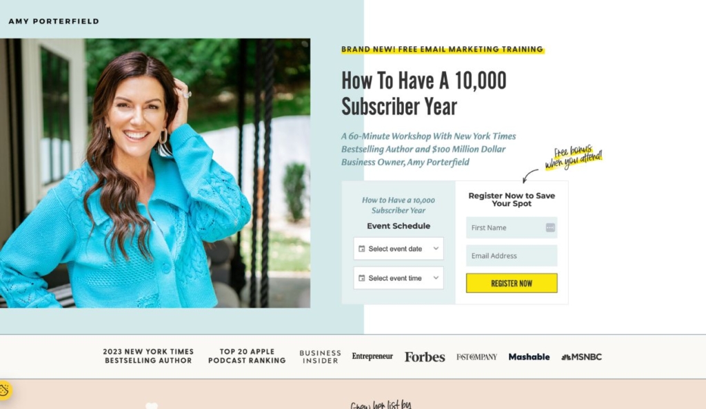
Amy Porterfield’s landing page for a free email marketing workshop
This landing page promotes a workshop-style webinar from marketing expert Amy Porterfield.
What stands out
- The landing page builds credibility for the webinar and appeals to an audience of marketers by incorporating hard numbers in the webinar descriptions (e.g. “How to Have a 10,000 Subscriber Year”) and an immediate testimonial provides legitimacy to the offer.
- Bright yellow is used strategically (and sparingly) to draw attention to only the most important details
25. Semrush
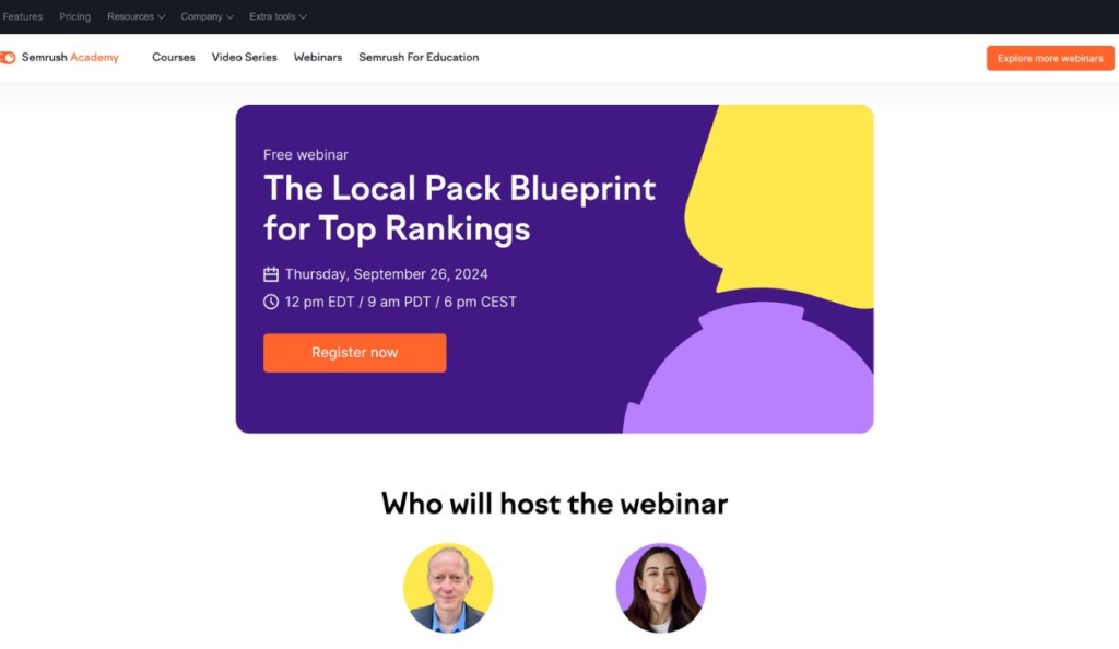
Landing page for a free webinar hosted by Semrush Academy
This landing page from Semrush Academy offers a webinar focused on optimizing local search rankings, providing strategies to improve visibility in the local pack on Google.
What stands out
- The landing page design is simple and easy to customize, making it an effective template for Semrush to use across their many different webinars
- Bright colors paired with a lot of white space make this landing page engaging but easy to skim
B2B landing page examples
26. Phunnel Builders
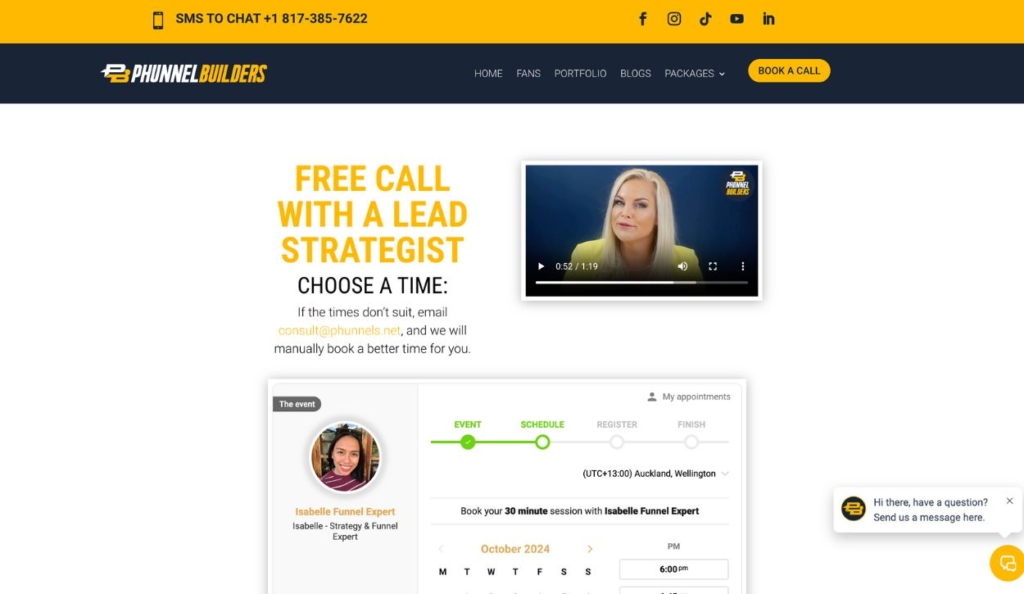
Phunnel Builders’ free call landing page
This free consultation landing page from Phunnel Builders encourages users to book a call for personalized funnel-building services.
What stands out
- The easy-to-navigate calendar booking system makes it convenient for page visitors to schedule a call
- Including a video at the top of the page is an engaging and personal way to provide information about the call and the business itself
Learn how Kartra slashed costs and boosted business for Phunnel Builders
27. Slack
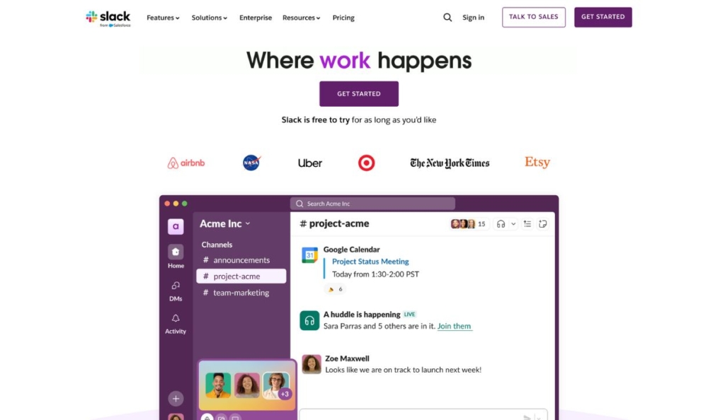
Screenshot of Slack homepage
Saas home pages often function as landing pages, like this example from Slack. The homepage promotes Slack as a communication tool for teams and encourages users to sign up for a free trial.
What stands out
- The page features a clear call-to-action to try Slack for free with an easy sign-up process
- The video in the center of the page shows what using Slack looks like in action, demonstrating the software’s value and ease of use
28. Shopify
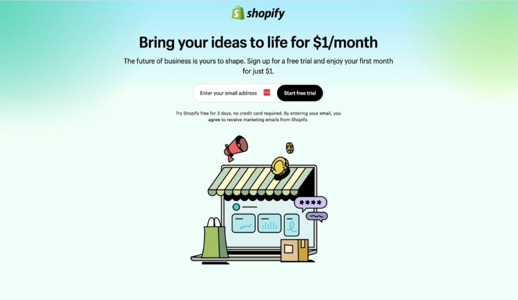
Shopify free trial landing page
This ad landing page for Shopify invites users to start a free trial of the e-commerce platform.
What stands out
- The page’s simple design and positive language convey how easy it is to get started with Shopify
- As a destination page for an ad, this saas landing page is focused on a singular goal — getting users to start their free trial
29. Gusto
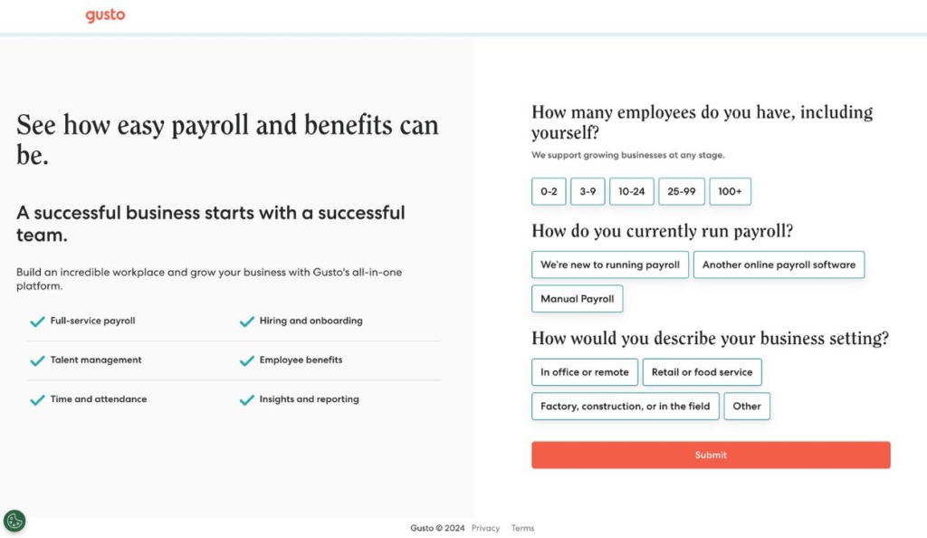
Gusto ad landing page
This ad landing page promotes Gusto’s payroll and HR services, encouraging small business owners to sign up for easy, all-in-one HR management.
What stands out
- The checklist of benefits and use cases for Gusto makes it easy to see what the software does at a glance
- The “quiz” on the right with pre-filled answers allows Gusto to get specific information from potential customers without demanding much of their time
30. BambooHR
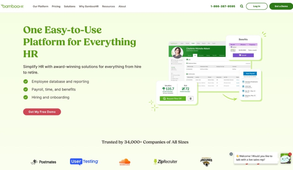
BambooHR homepage
The BambooHR homepage promotes a free demo for the online HR software.
What stands out
- While the software offers comprehensive HR capabilities, the homepage narrows in on the most important features and messaging to convince users to sign up for a free trial
- The pop-up chat in the right-hand corner gives users the opportunity to speak with a sales representative
31. Acquisition.com
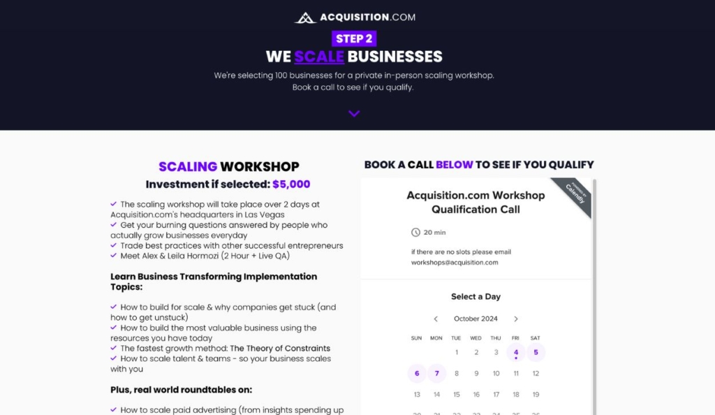
Acquisition.com workshop landing page
This landing page for Acquisition.com promotes their business growth workshop.
What stands out
- The landing page messaging accurately conveys a sense of exclusivity and premium value
- Selective use of highlighted text draws attention to the most important elements on the page
32. The Copy Worx
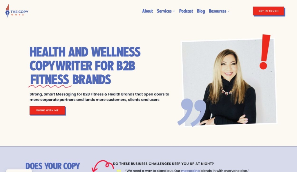
Homepage for The Copyworx
This Copy Worx homepage and landing page promotes professional copywriting services for B2B fitness and health brands.
What stands out
- The crystal clear messaging on this landing page immediately identifies the business’s target audience
- Bright, descriptive CTAs are featured at every section of the homepage, making it easy for users to take the next step
Lead magnet landing page examples
33. Marie Forleo
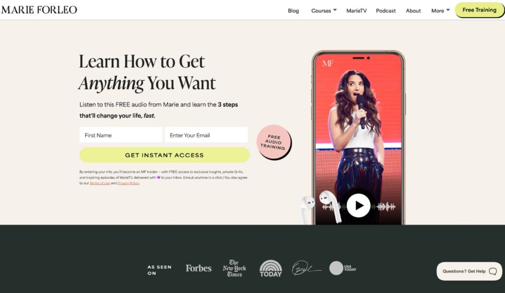
Landing page for Marie Forleo’s free training lead magnet
This landing page on Marie Forleo’s website promotes a free training video as a lead magnet. Visitors who sign up receive access to this training and are subscribed to Mari Forleo’s email list.
What stands out
- This landing page features audience-centric messaging that aligns with their goals and makes them feel they’re getting high-value information in return for their contact details
- The vibrant, engaging design conveys enthusiasm and optimism
Leverage this powerful lead-generation strategy for your online business!
34. Jonathan Goodman
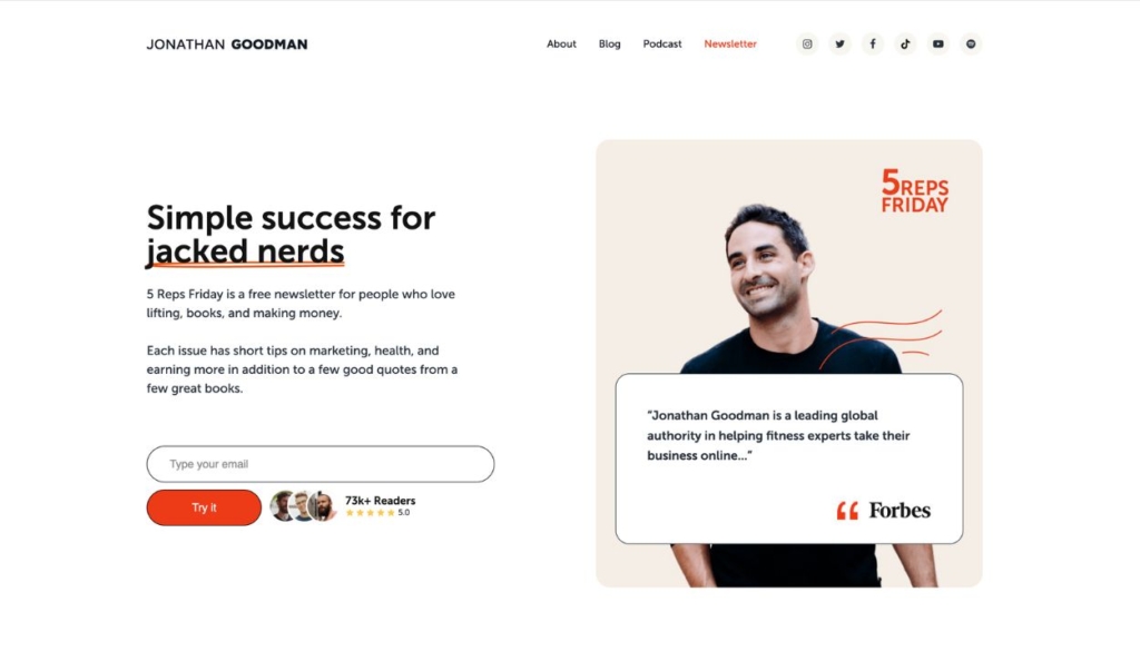
Landing page for Jonathan Goodman’s free newsletter
Jonathan Goodman uses this lead magnet landing page to offer a free newsletter subscription with tips, advice, and strategies for personal trainers to grow their businesses.
What stands out
- This landing page incorporates simple but powerful social proof — displaying the number of current newsletter subscribers and listing his “as seen in” brands
- Creative but industry-specific copywriting drives home the relevance of this newsletter for fitness pros
35. Cody Burch
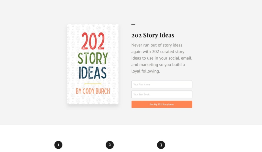
Landing page for Cody Burch’s 202 Story Ideas lead magnet
This landing page offers a PDF download from Cody Burch that helps people tell their stories and build a following.
What stands out
- The simple 1-2-3 steps at the bottom of the page show how to use the lead magnet and the value it provides
- The straightforward opt-in form is easy to fill out and makes a clear promise of immediate value
36. Bossbabe
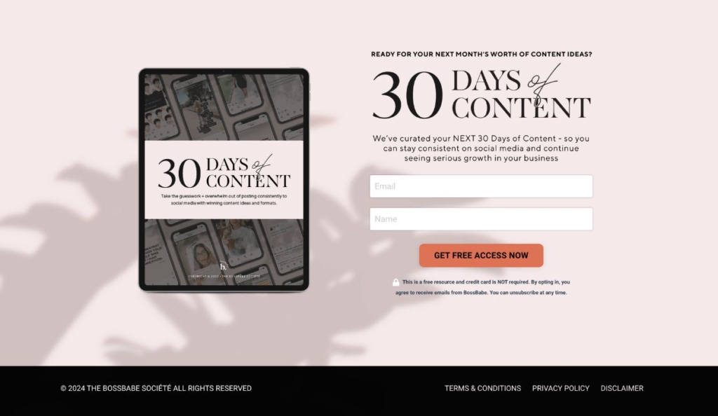
Landing page for a content calendar lead magnet from Bossbabe
This landing page promotes a free 30-day content calendar from Bossbabe, designed to help entrepreneurs plan and create engaging social media content.
What stands out
- This landing page conveys a professional brand image with minimal text and a simple layout that is easy to navigate on a desktop or mobile device
- The disclaimer beneath the form reassures visitors that they don’t need to input credit card information but notifies them that they will receive emails from the brand
37. Cardone Capital
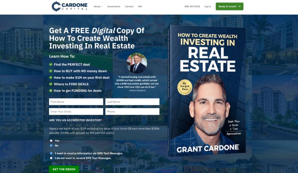
Landing page for a free ebook by Grant Cardone
This landing page from Cardone Capital offers the digital version of Grant Cardone’s real estate investing book as a lead magnet.
What stands out
- The graphic displaying Grant Cardone’s book and his status as a New York Times Bestselling Author successfully conveys the value of this lead magnet
- The bullet point list of what the book teaches motivates sign-ups by appealing to the audience’s values and pain points
38. Hey Jay
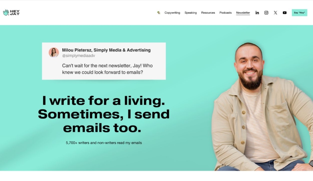
Landing page for Jasmin Alic’s newsletter
This newsletter landing page promotes Jasmin Alic’s free email newsletter focused on delivering actionable business and marketing tips.
What stands out
- Jasmin uses creative, humorous messaging to overcome potential objections to being added to an email list
- Different types of social proof work together to reinforce the value of signing up for this newsletter
Check out these tips on how to build a personal brand website (+ examples)
39. Breaking B2B
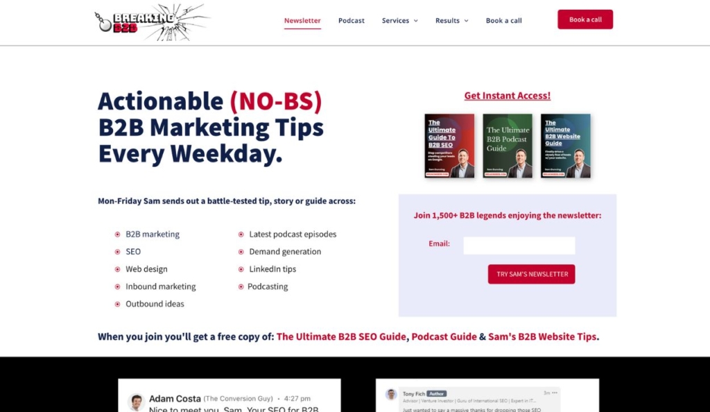
Landing page for Sam Dunning’s B2B marketing newsletter
This Breaking B2B landing page offers a free subscription to Sam Dunning’s email newsletter about B2B marketing insights and strategies.
What stands out
- The messaging on this landing page immediately addresses possible objections
- Sam motivates newsletter sign-ups by offering other free resources upon subscribing
40. Kate Lyman Nutrition
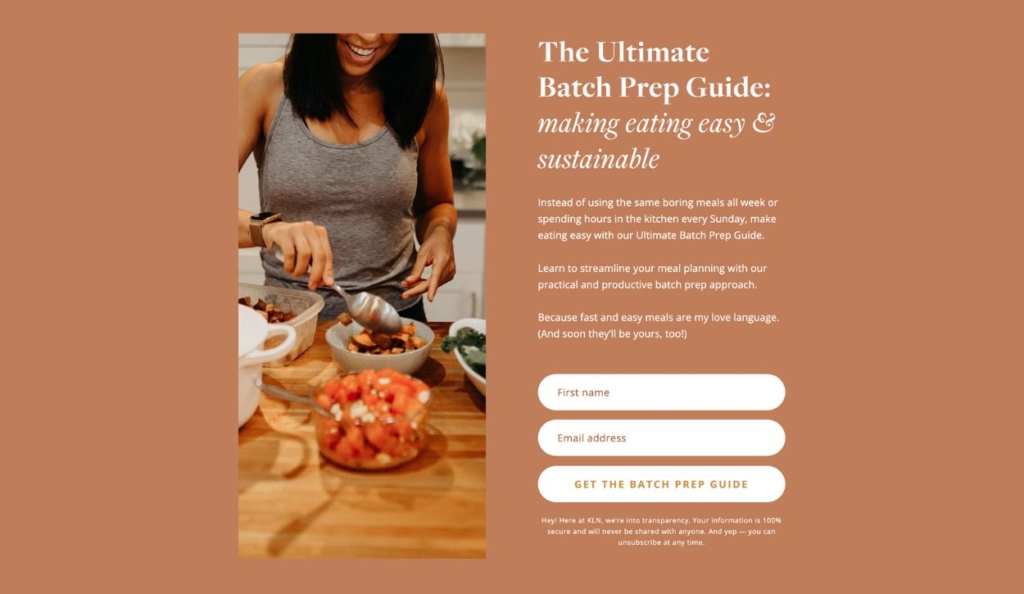
Landing page for The Ultimate Batch Prep Guide by Kate Lyman Nutrition
This landing page from Kate Lyman Nutrition offers website visitors a meal prep guide as a lead magnet.
What stands out
- Candid photography paints a picture of what the guide will help the customer accomplish and sets a warm and inviting tone consistent with the rest of the website
- Requiring only a first name and an email address on the opt-in form makes it easy for leads to sign up for the guide
41. Sahil Bloom
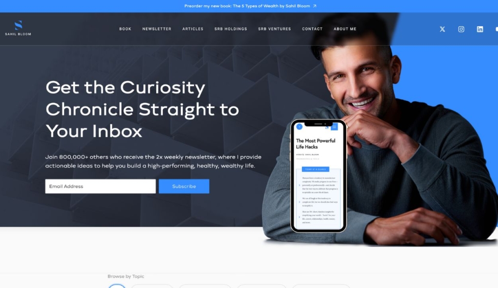
Landing page for Sahil Bloom’s email newsletter
This landing page offers a free subscription to Sahil Bloom’s newsletter, which provides insights on a wide range of topics from personal growth to business strategies.
What stands out
- The concise description of the newsletter sets expectations for the emails’ frequency and value
- Including an archive of past emails gives visitors immediate value and shows what they can expect from signing up
Membership landing page examples
42. The Monetized Mom
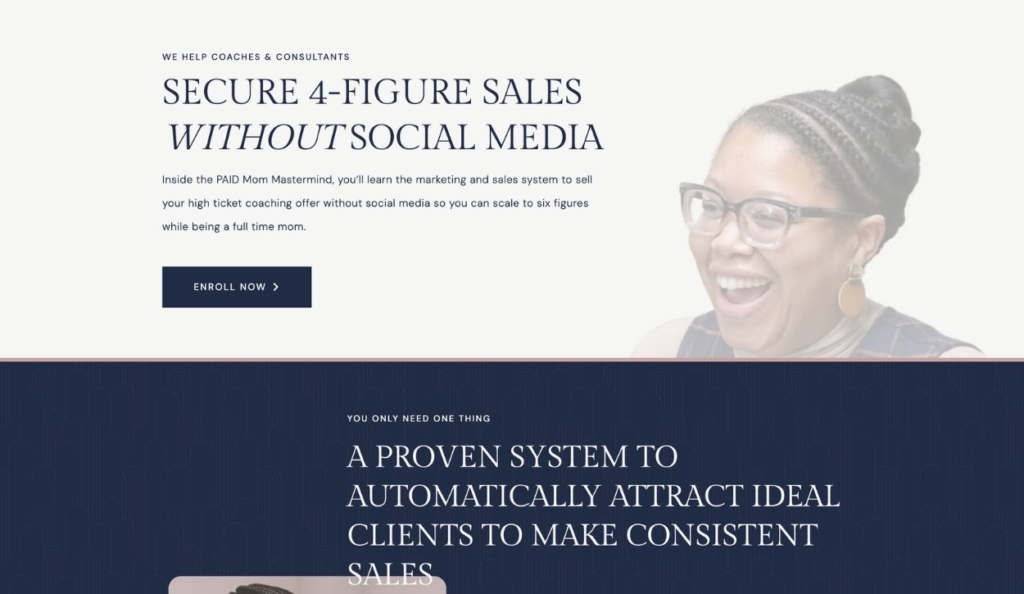
Landing page for the Paid Mom Mastermind program
This landing page promotes the Paid Mom Mastermind — a 12-month program for mom entrepreneurs that offers support, coaching, and resources to help them grow their online businesses.
What stands out
- Candid, original photography sets the joyful but professional tone of this landing page, and drives home the sense of community that the membership provides
- This landing page provides comprehensive details, social proof, and other information necessary to sell a high-ticket membership
43. The Soulshine Creative
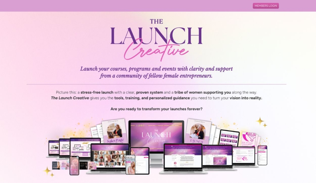
Landing page for The Launch Creative membership
This landing page offers access to The Launch Creative — a membership offered by The Soulshine Creative that provides a system and a community for female entrepreneurs launching online courses, programs, and events.
What stands out
- The detailed checklist of membership benefits conveys value and exclusivity to motivate sign-ups
- Consistent branding creates a cohesive brand image and sets the tone for the membership program
The all-in-one marketing software that simplified everything
44. She Runs Ultras
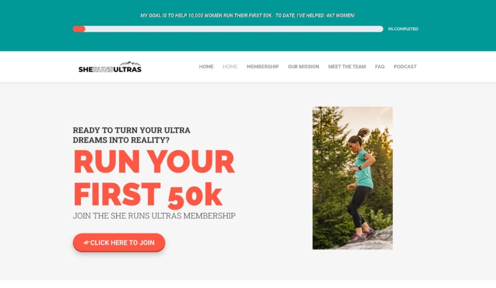
Landing page for the She Runs Ultras membership program
The She Runs Ultras membership landing page offers a program to help women run their first 50k.
What stands out
- Because this membership helps women tackle a challenging goal, the landing page emphasizes community support and taps into audience motivators
- The landing page provides transparent pricing details with two different packages representing different membership levels
45. Stephanie Ridgway DPT
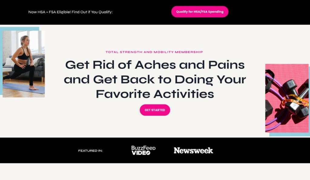
Landing page for Stephanie Ridgway’s Total Strength and Mobility Membership program
This landing page offers a strength and mobility membership program created by physical therapist Stephanie Ridgeway.
What stands out
- The main heading on this landing page captures visitors’ attention by appealing to their (actual) pain points and values
- The landing page follows an intuitive outline, starting with the audience’s challenges, describing the solution, and then breaking down the details of the membership
46. The Book Incubator

Homepage for The Book Incubator program
This landing page for The Book Incubator membership program encourages authors to sign up for a structured, guided process that will help them write, edit, and publish their novels.
What stands out
- The countdown header creates a sense of urgency to motivate sign-ups
- The landing page immediately addresses a common objection (“just another writing class”) to convey unique value and inspire authors to apply for the membership
47. REI Co-op Membership
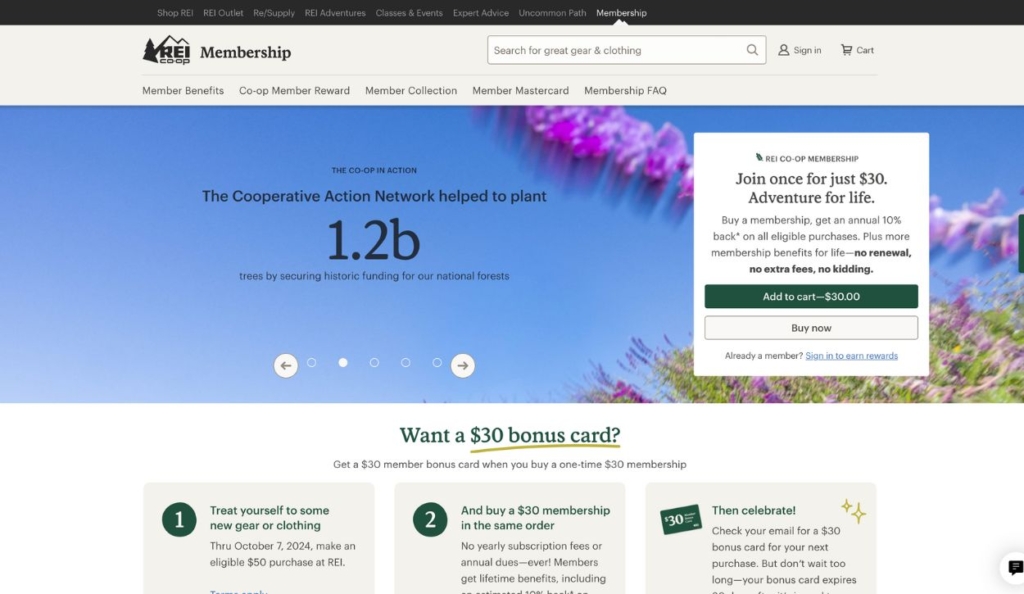
Landing page for REI’s membership program
Website visitors can sign up for REI’s popular membership program through this landing page.
What stands out
- REI appeals to a wide range of motivators by listing different membership benefits in a slider at the top of the page
- The landing page messaging makes REI’s membership program feel like a no-brainer by offering coupons and promising a one-time fee with no catches
48. Lottie Murphy
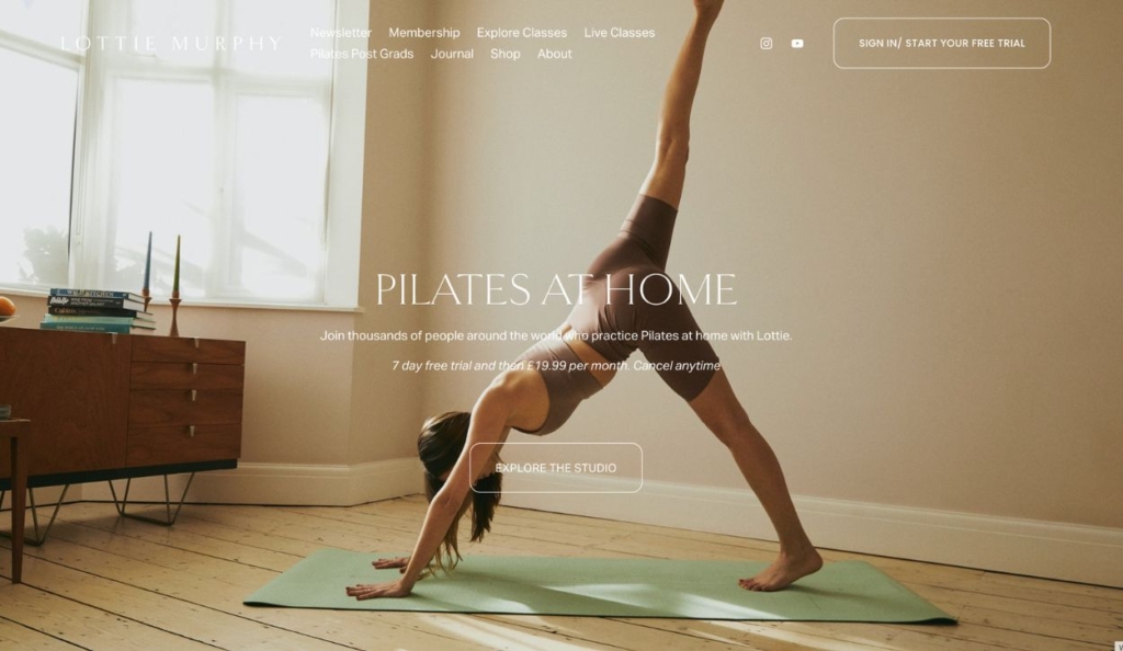
Homepage for Lottie Murphy’s Pilates membership
This landing page promotes an online Pilates membership created by Lottie Murphy, offering access to workout videos, tutorials, and fitness resources for Pilates enthusiasts.
What stands out
- The landing page overcomes customer hesitation and encourages sign-ups by focusing on the membership free trial and convenient cancellation policy
- A video trailer for the membership’s latest challenge piques interest in the membership and gives users a reason to join now
Kartra’s all-in-one platform makes it easy
49. Sohee Fit
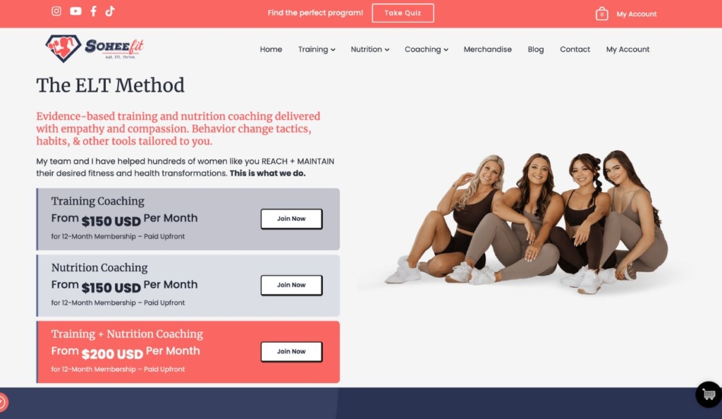
Landing page for Sohee Fit membership programs
This landing page from Sohee Fit offers coaching membership programs based on Sohee Carpenter’s ELT (Evidence-Based Lifting and Training) method.
What stands out
- Each membership tier and its price is clearly defined, making it easy for users to choose the best option for their needs
- This landing page includes long, detailed bios for the coaches which reinforces the program’s credibility and evidence-based methodology
50. Food Blogger Pro
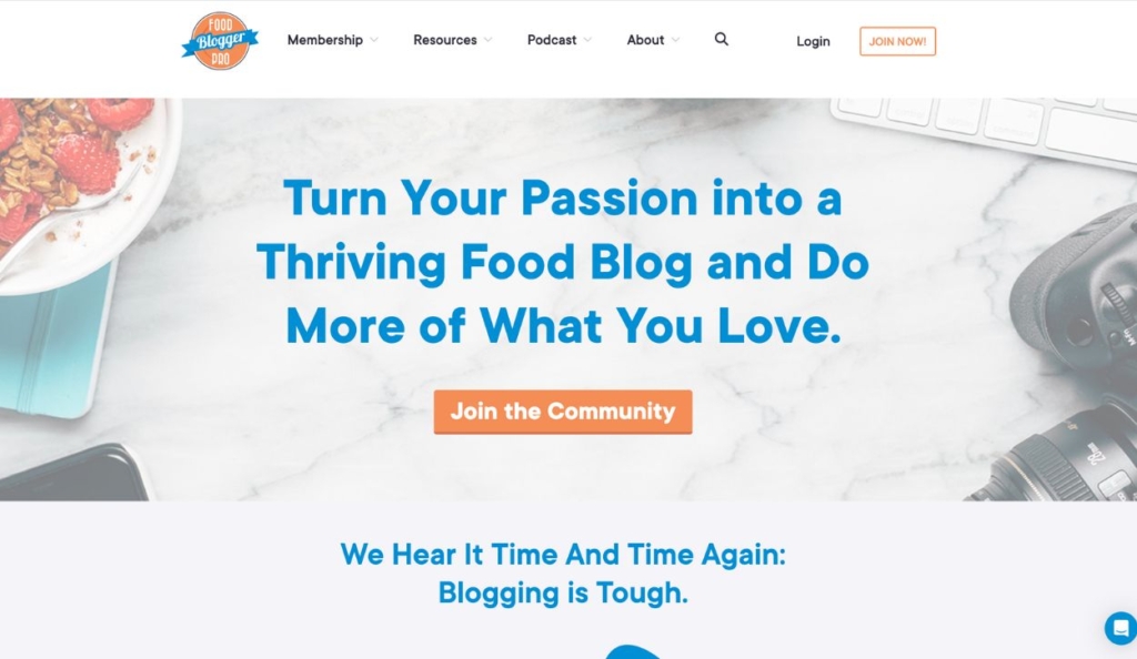
Landing page for The Food Blogger Pro membership program
The Food Blogger Pro membership landing page offers access to tutorials, tools, and community support for aspiring and established food bloggers.
What stands out
- The landing page appeals to the audience with messaging that addresses specific goals (such as learning SEO best practices) and overarching motivators (earning more money)
- Social proof is incorporated all throughout the landing page to reinforce the membership’s value as you scroll
What does a good landing page look like?
A good landing page is designed to persuade a particular audience to take a particular action. While the details will look different for every brand, all great landing pages are honed in on a focused goal — with no distractions and no fluff.
Your landing page should include these key elements…
- Clear and compelling headlines
- Engaging images or videos
- Strong and visible CTA buttons
- Concise and persuasive copywriting
- Testimonials, case studies, or other social proof
Tailor each element to your audience — anticipating their hesitations and appealing to their values and pain points. Make it as easy as possible for them to take the next step in the customer journey, whether booking a free consultation or downloading a resource.
We also recommend running regular A/B tests on different elements of your landing page to see what improves your conversion rates. Just be sure to only test one element at a time.
What is the difference between a website and a landing page?
A website fulfills a variety of functions, from introducing a brand to listing available products or services. A landing page is a type of web page intended to convince the page visitor to take a specific action — such as signing up for a free trial or making a purchase.
A landing page may be a one-off page that users land on when they click on a PPC ad, or it can even be a homepage (as is often the case for saas websites)
Convert more leads with Kartra’s landing page builder
Kartra is the best landing page builder for online entrepreneurs with hundreds of professionally designed landing page templates and intuitive drag-and-drop functionality.
And unlike standalone page builders, Kartra is an all-in-one platform offering the comprehensive slate of marketing tools you need to grow your online presence:
- Landing page builder
- Form builder
- Email marketing
- Membership software
- Webinar and video capabilities
- Checkout software
- Sales funnel builder
With Kartra, there’s no need to stitch together sales funnels using multiple software tools. Instead, easily set up powerful funnels that nurture leads through every step of the customer journey — focusing your time on optimization as you learn which marketing strategies resonate with your target audience.
Create eye-catching landing pages and powerful sales funnels with Kartra’s all-in-one marketing software
Get started today.

